GLAZES DESIGNED IN OUR STUDIO
Hickory Clay is the only cone 6 pottery studio in the Bay Area with a fully in-house designed glaze library.
While other cone 6 community studios buy commercial glazes off the shelf, every glaze in our collection is formulated, tested, and mixed by hand in our Mission District studio. It's a craft commitment most studios don't make — and it's our biggest point of pride in the studio.
On this page:
WHY THIS MATTERS
When you take a piece out of the kiln, the glaze is the moment everything you've built comes together — or falls apart. Inconsistent commercial glazes are a quiet frustration at most pottery studios: a color that mottles unpredictably, a finish that crawls or pinholes, a batch that fires differently than the last one. Members at other studios learn to expect surprise; we don't think they should have to.
By designing our own glazes, we control every variable. We know exactly how each glaze behaves on each clay body, at our firing temperature, in our kilns. The result: what you pull from the kiln looks the way you imagined it would — every time.
A GLAZE LIBRARY BUILT FOR REAL WORK
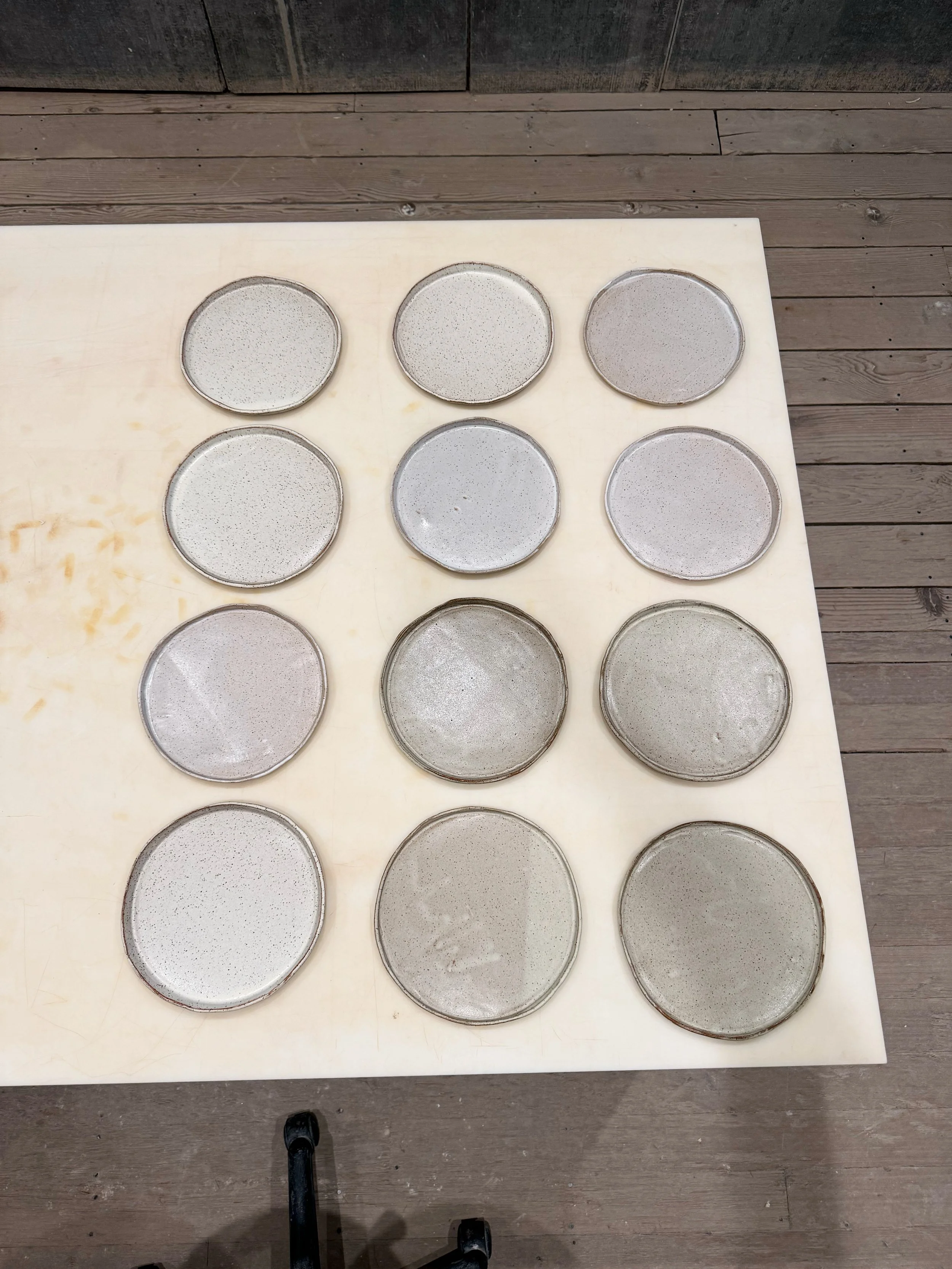
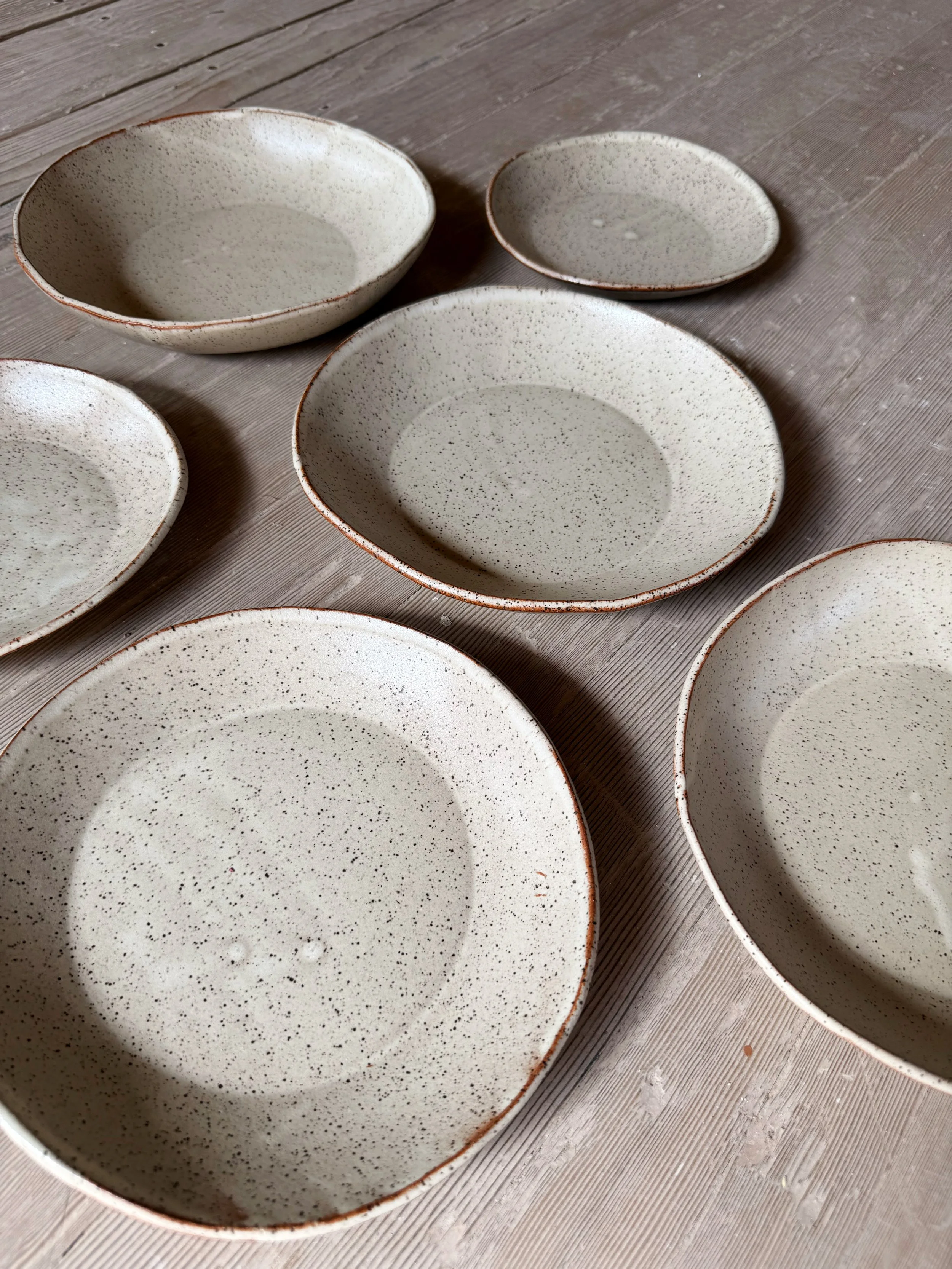
25 core glazes stocked year-round in 10-gallon batches. These are our workhorses — the colors and finishes you can rely on for sets of dishes, full bodies of work, or pieces you want to repeat over months and years.
40 seasonal glazes rotate through one-gallon batches throughout the year. Some are experimental, some are limited runs of a favorite, some are responses to what members are exploring. There's always something new on the shelf. Members can request new colors.
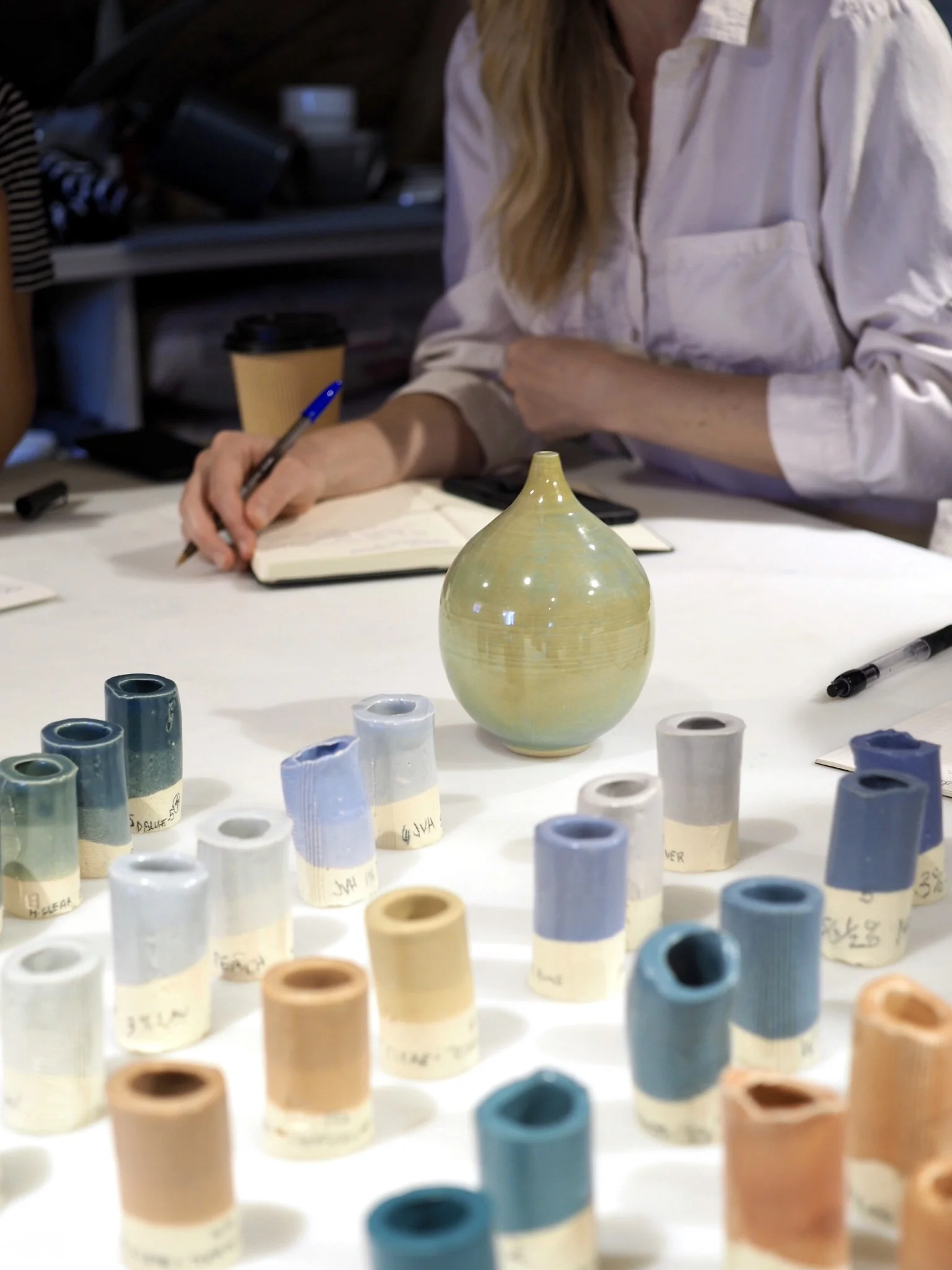
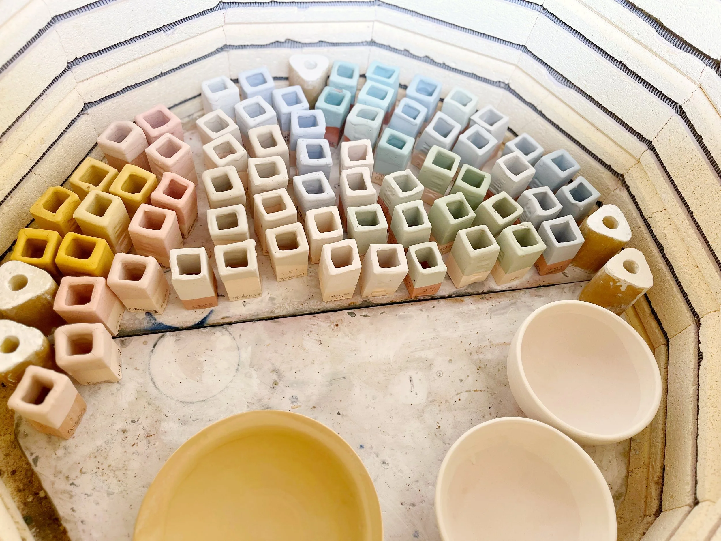
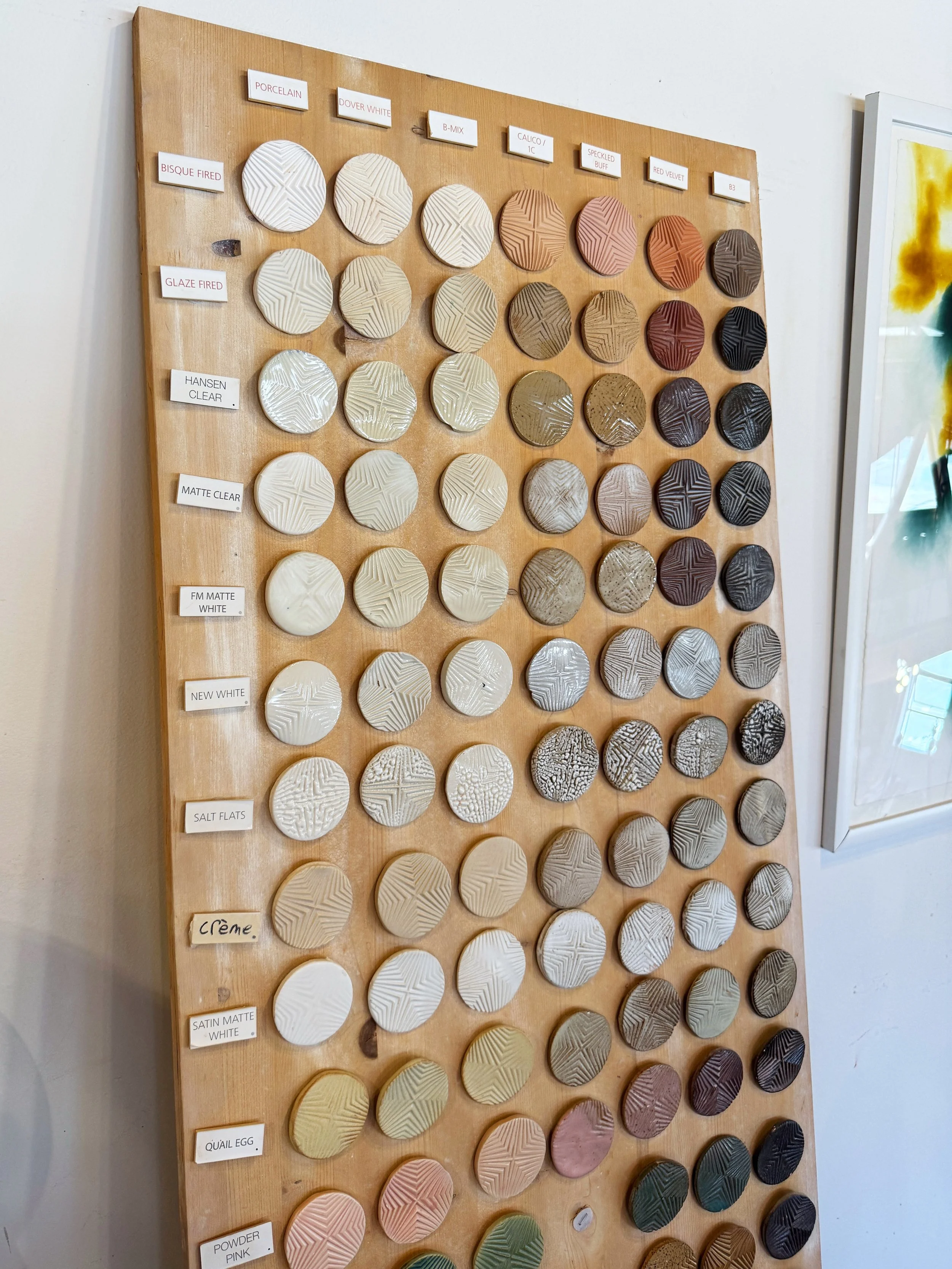
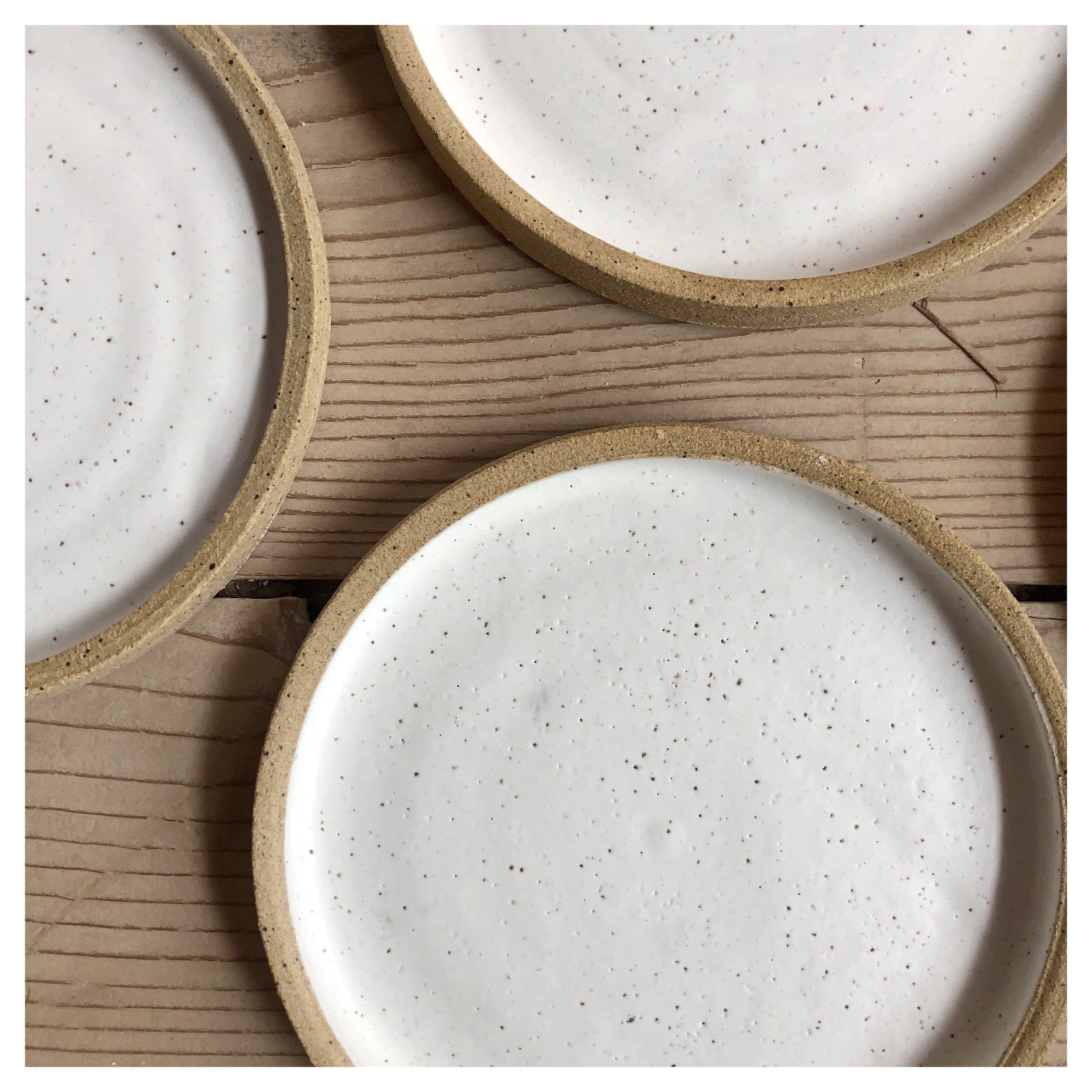
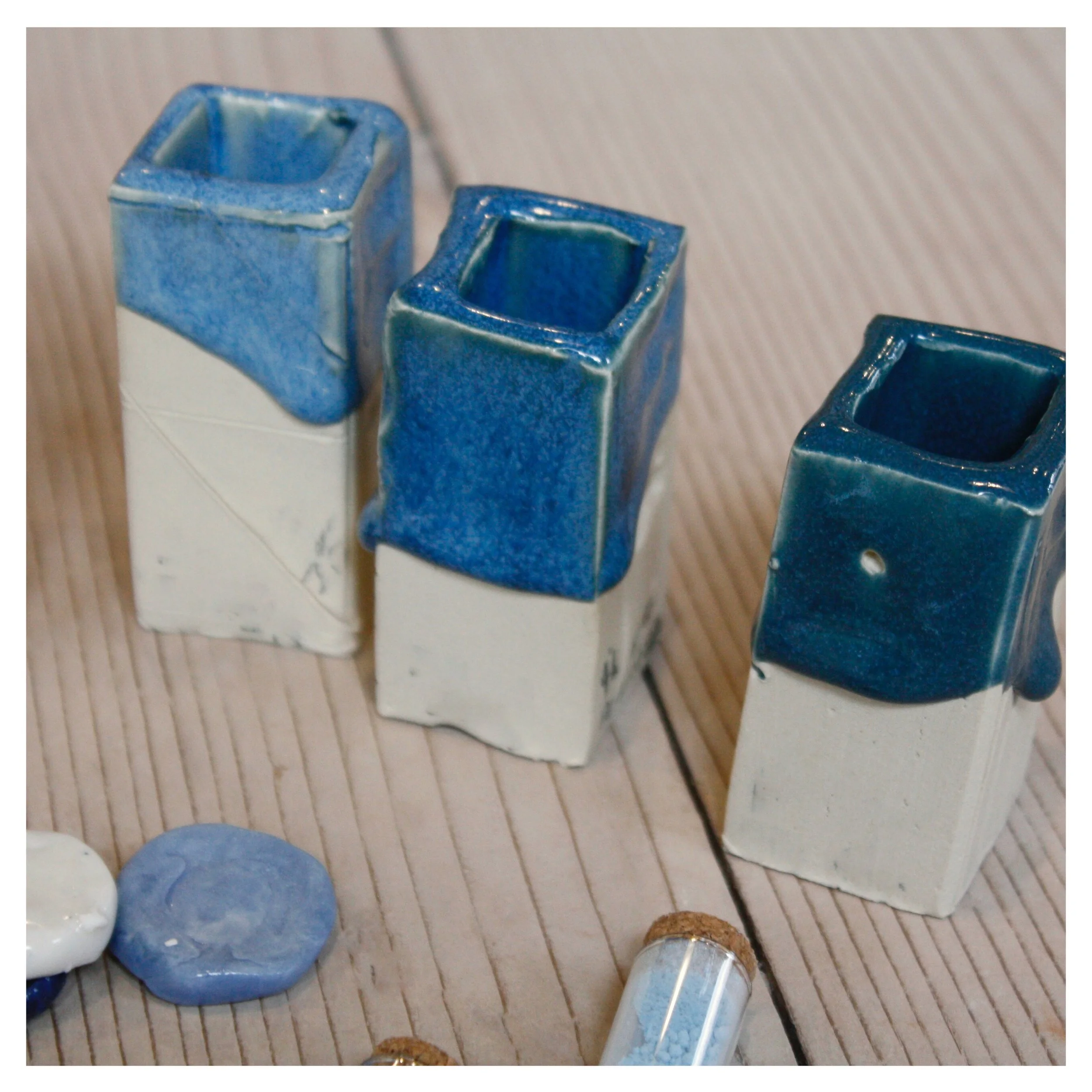
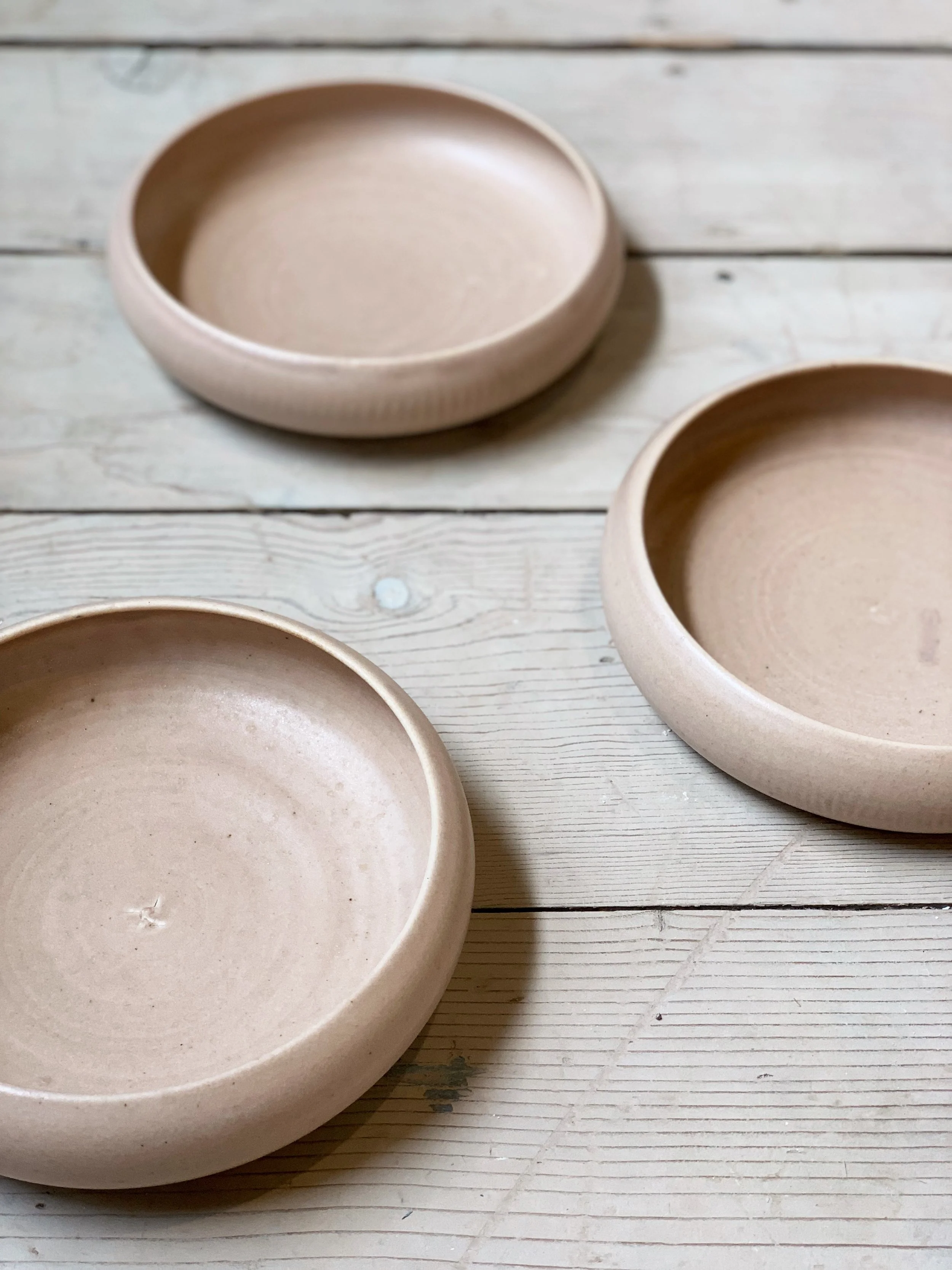
Custom palettes designed for our clay bodies. Our glazes are tested against the seven clay bodies we stock — porcelain, B-mix, Dover white, speckled buff, stoneware 1C, Red Velvet, and Dragon Fruit — so members know how a given glaze will look on their chosen clay before they apply it.
A CONSIDERED PALETTE
We don't make every glaze we technically could make. We make the glazes we want to use — and we want to use mattes and neutrals.
This is a deliberate point of view, and it's the second reason our glaze library exists in the first place. Commercial glaze companies build for mass appeal, which means most catalogs lean glossy, saturated, and primary. Bright reds. Cobalt blues. Glossy yellows. There's nothing wrong with those colors, but they aren't what we make pottery in — and they aren't what makes a piece feel quietly considered on a shelf or a table.
WHY MATTE?
Matte glazes are also genuinely harder to formulate. Most commercial vendors offer only a handful of true mattes because the chemistry is unforgiving — too matte and the surface becomes chalky and unfriendly to touch; not matte enough and you lose the soft, light-absorbing quality that makes matte work. The sweet spot is narrow, and it requires testing.
Every matte glaze in our library has been formulated for that sweet spot — soft enough to feel like silk under your hand, durable enough for daily use on functional ware, and consistent enough to fire the same way every time.
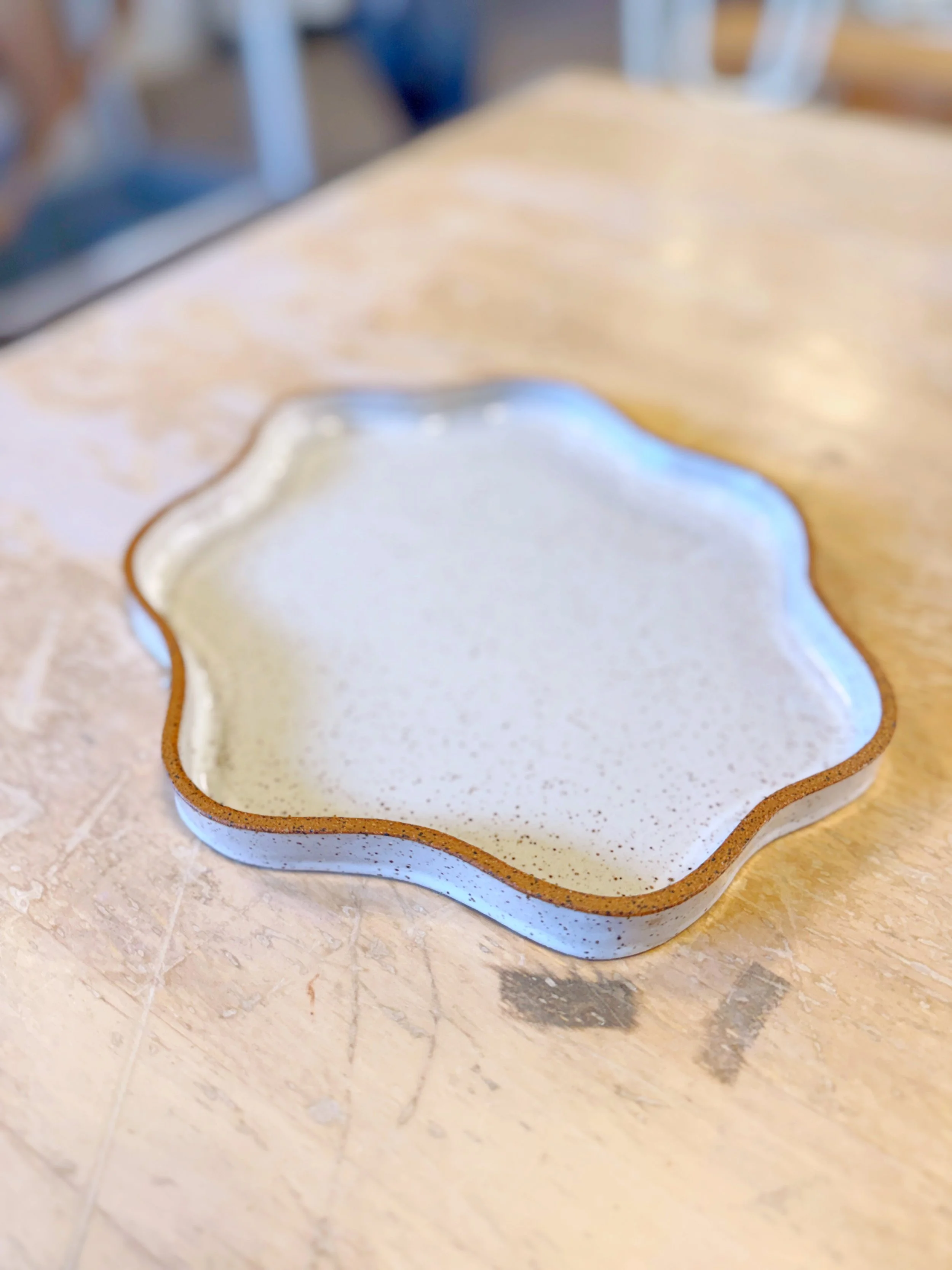
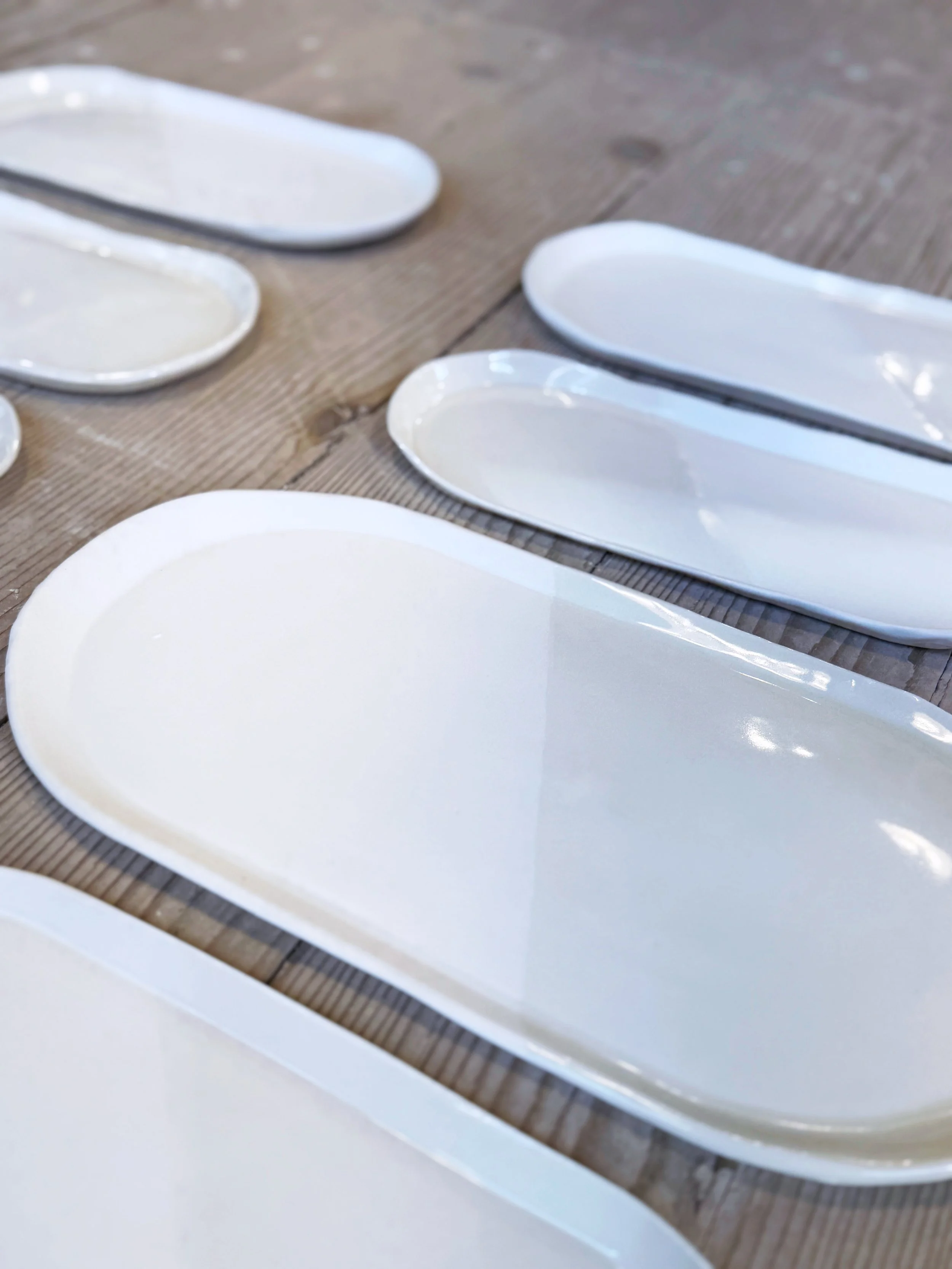
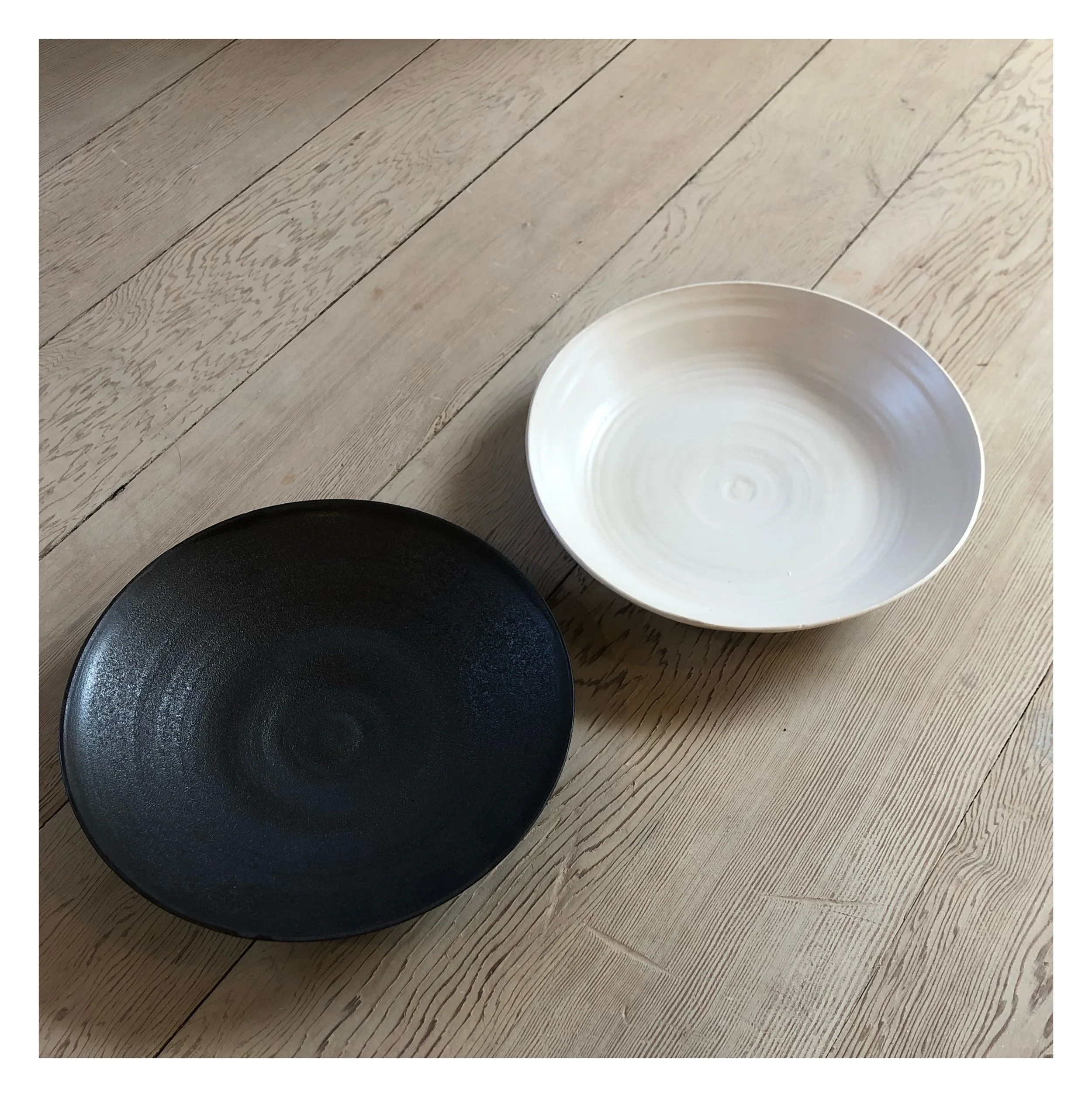
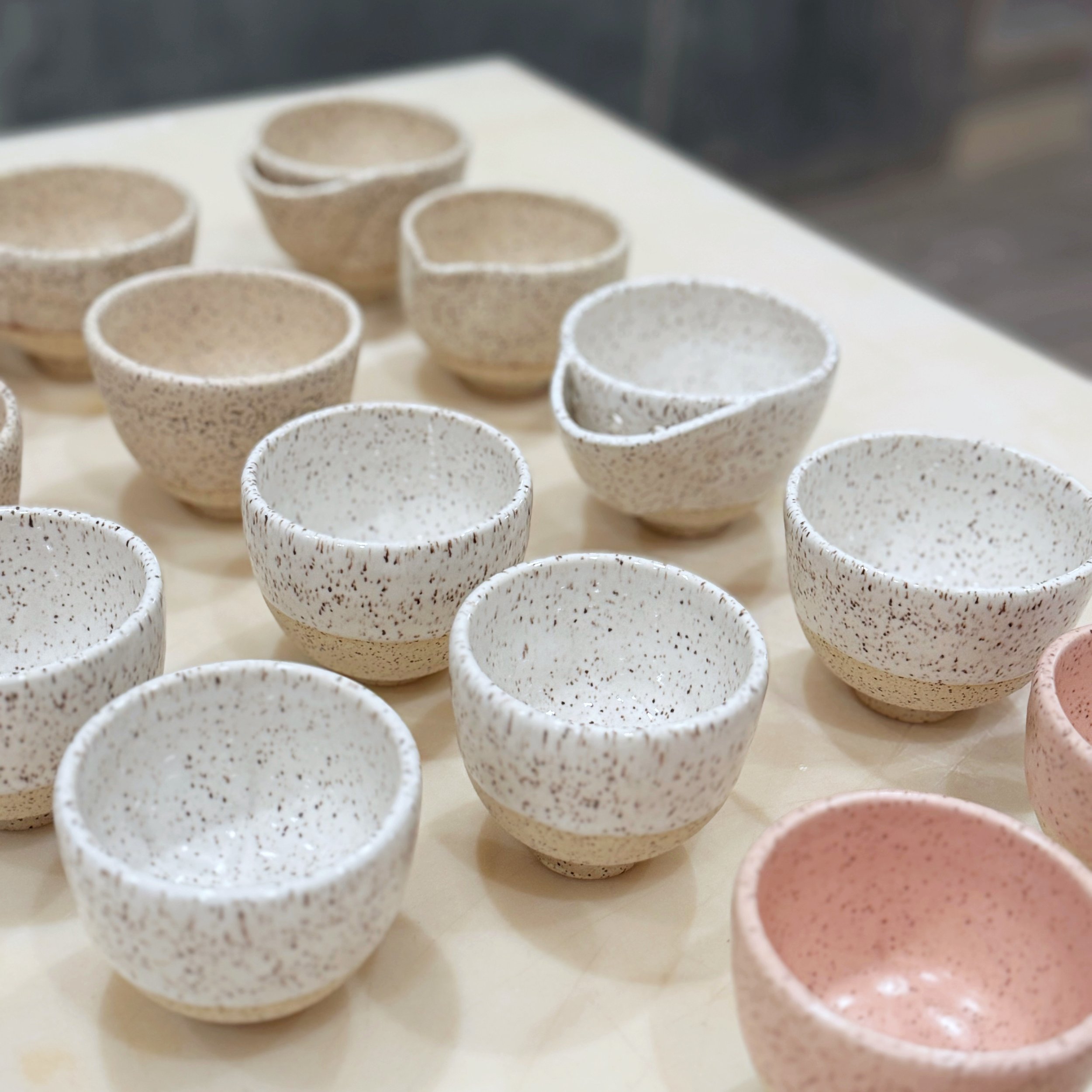
SEVEN WHITES AND CLEARS
A small example of how deeply we think about color: we offer seven distinct whites and clears as standard glazes, each with its own character.
Satin Matte White — a cool, opalescent white with quiet luminosity
FM Matte White — a warm white with a softer, more solid feel
New White — a cool, clean white with a high shine
Matte Clear — a milky translucent matte that lets the clay body show through
Hansen Clear — a true transparent gloss for showing texture or color underneath
Salt Flats — a glossy white that separates during firing for surface drama
Quail Egg — a warm speckled matte
Seven whites might sound excessive. It isn't. A potter making porcelain dinnerware needs a different white than a potter making a slip-decorated stoneware vessel, who needs a different white than a potter glazing a piece for the dining table versus the mantelpiece. Real craft is in the choices — and we want our members to have the choices that matter.

COLOR, CONSIDERED
When we add a color to the library, it's because it does something a commercial glaze can't. Our Powder Pink isn't the bubblegum pink of a commercial pink jar; it's a soft, buttery, partially transparent pink that gains richness on darker clays and develops a mild crackle in firing. Our Satin Bae Green isn't the kelly green or sage green of a commercial catalog; it's a soft, grey-leaning green that reads as considered, not cheerful. Our Golden Hour isn't a primary yellow; it's a warm, flat finish that breaks into a gradient where it thins.
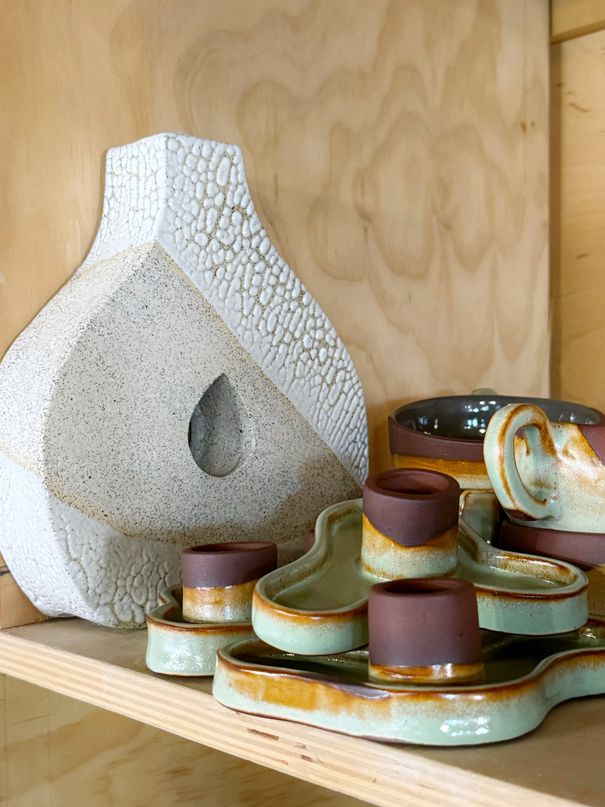
Every color in our library passed an internal test: would we want to use this on something we made? If the answer was no, we didn't make more of it. We focus on the workhorse glazes, and make fun adjustments for our seasonal glazes. We have over 75 Mason Stains in our color library.
THREE GLAZES THAT ARE UNIQUELY OURS
These are the glazes we've spent the most time perfecting — the ones members and students reach for again and again, and the ones that capture what makes our library different from anything you'd buy off the shelf.
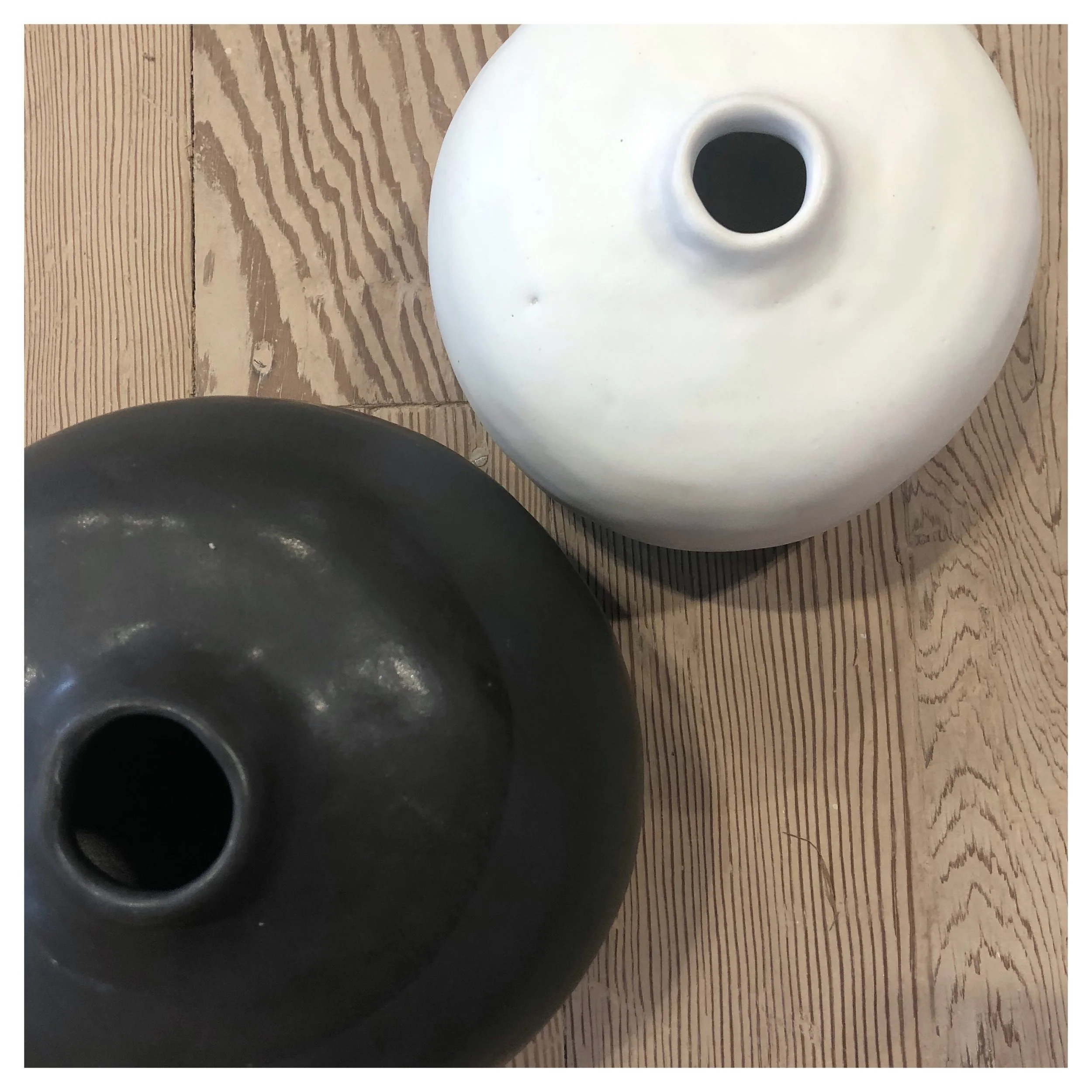
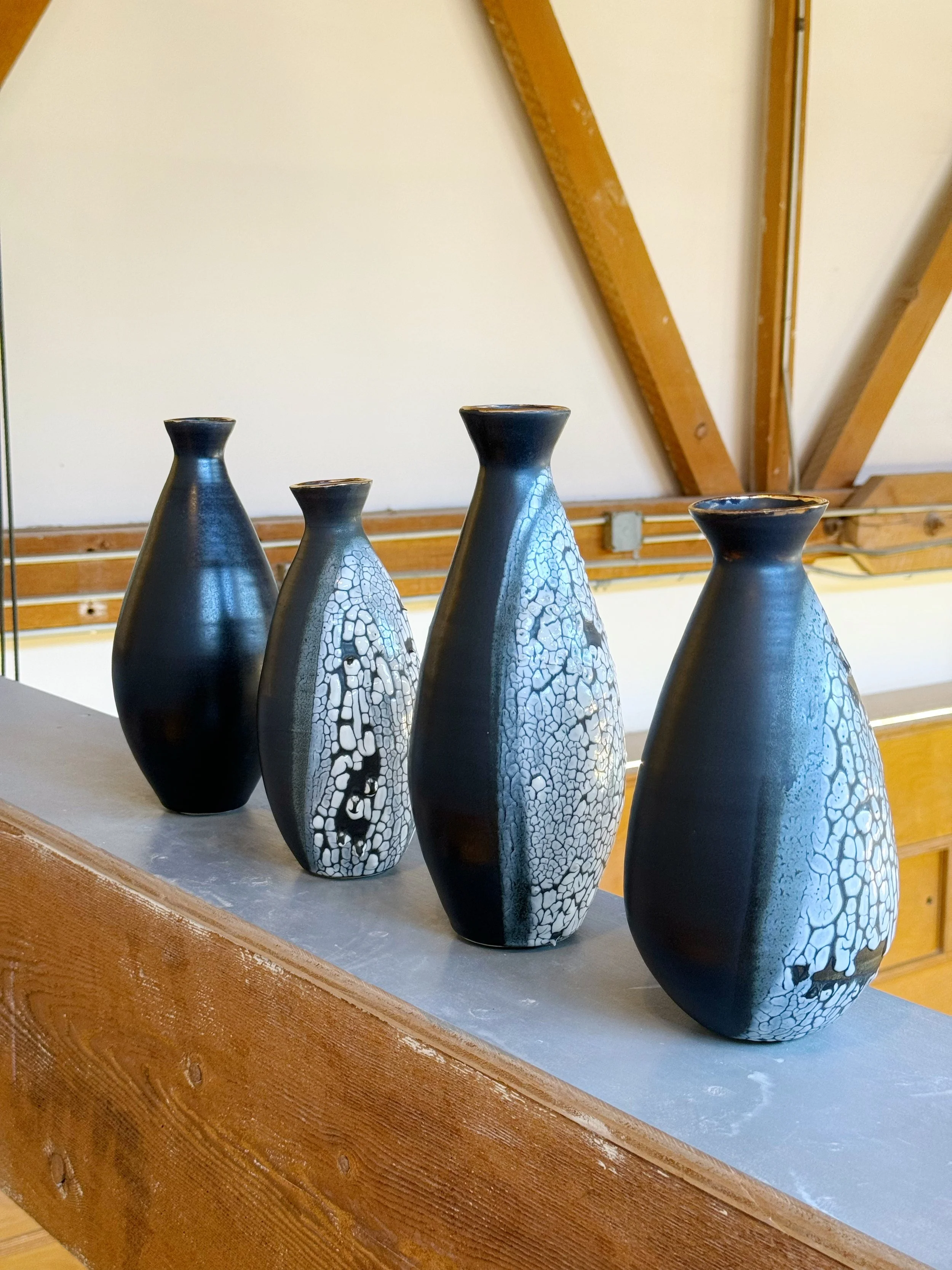
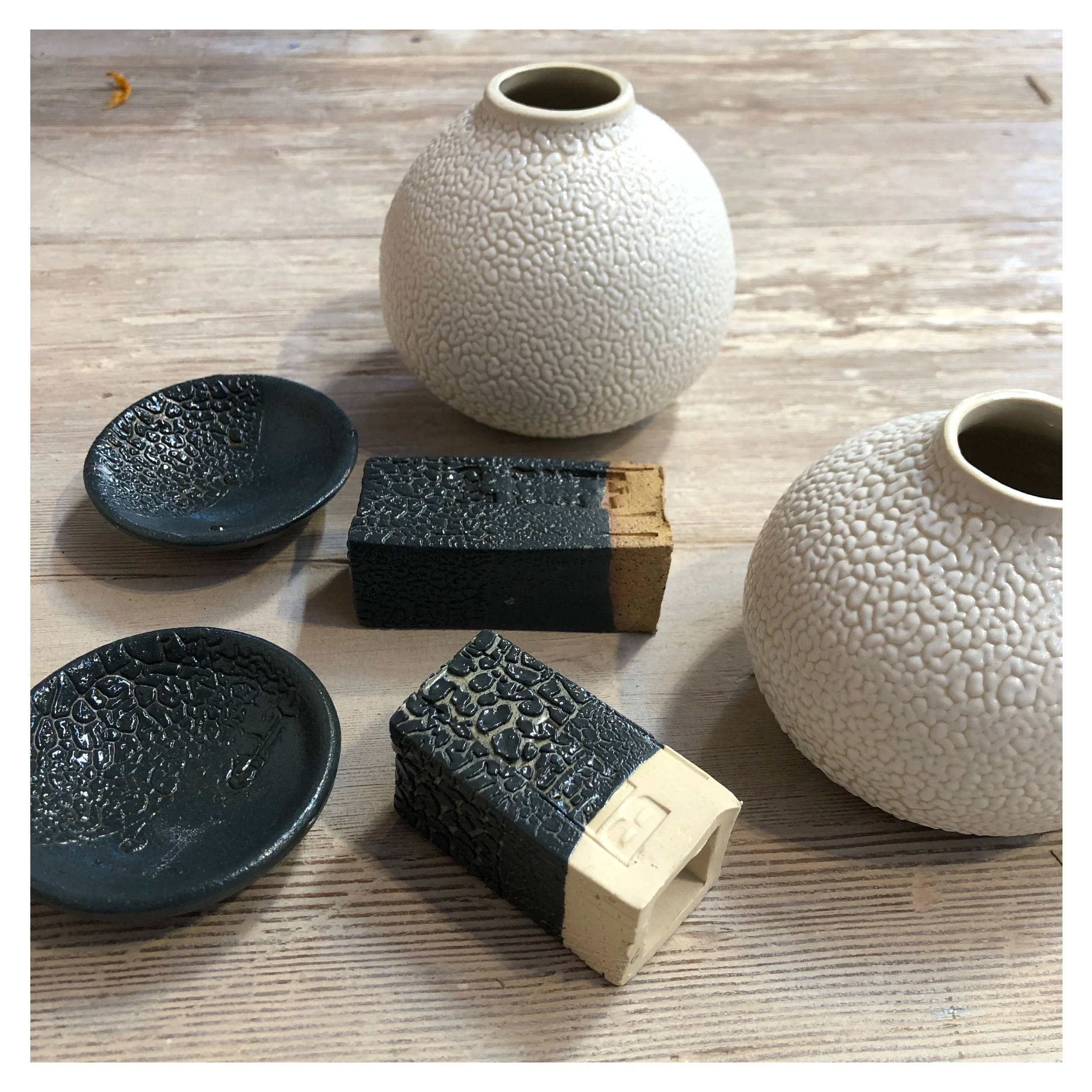
MATTE BLACK
A stunning, velvet black that feels expensive without trying. Matte Black is our most-loved glaze, and it's the one we recommend to beginners and serious potters alike.
What sets it apart:
Velvet finish — soft to the touch, never glossy or plasticky
Hides fingerprints — a real practical advantage for functional ware
Beginner-friendly — forgiving in application, consistent in firing
Laboratory-tested food safe — you can use it on dinnerware with confidence
It's the rare glaze that's easy to use and looks sophisticated on the table. We can't think of another cone 6 black with this combination of depth and reliability.
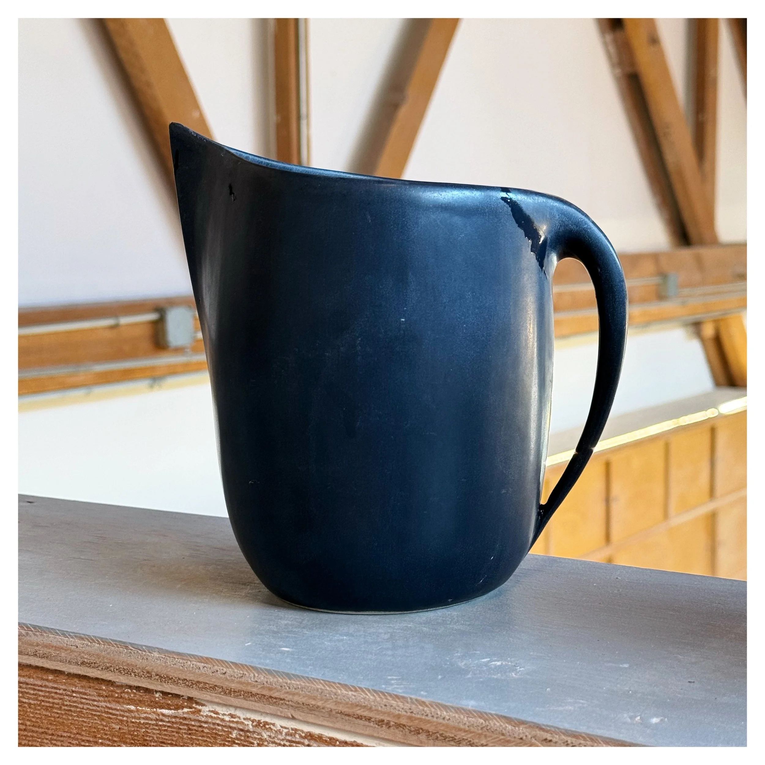
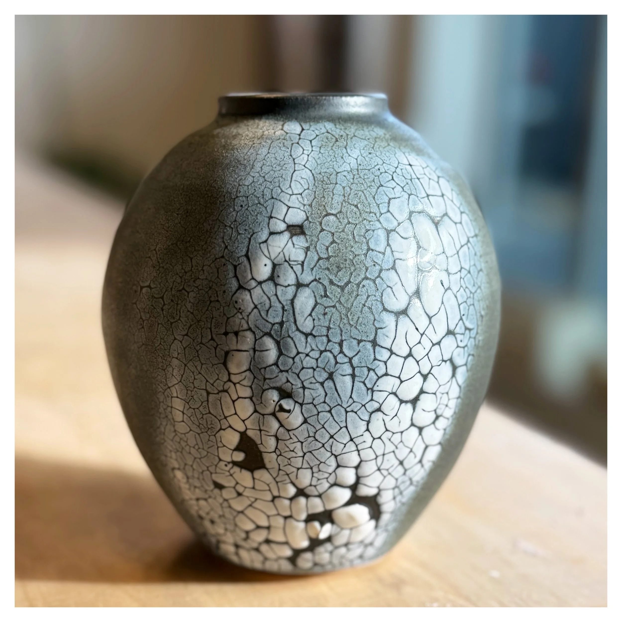
SATIN MATTE WHITE
If Matte Black is the workhorse, Satin Matte White is the showpiece. Our most sought-after white, formulated for opalescence and softness rather than the chalky flatness of most commercial mattes.
What sets it apart:
Cool white tone — neither yellow nor blue, with a quiet luminosity
Soft opalescence — catches light differently across a curved surface, the way real porcelain does
Soft to the touch — a satin finish that feels considered, not dry
Visual airiness — pieces glazed in Satin Matte White feel lighter than they are
This is the glaze members ask for when they're making something they want to keep.
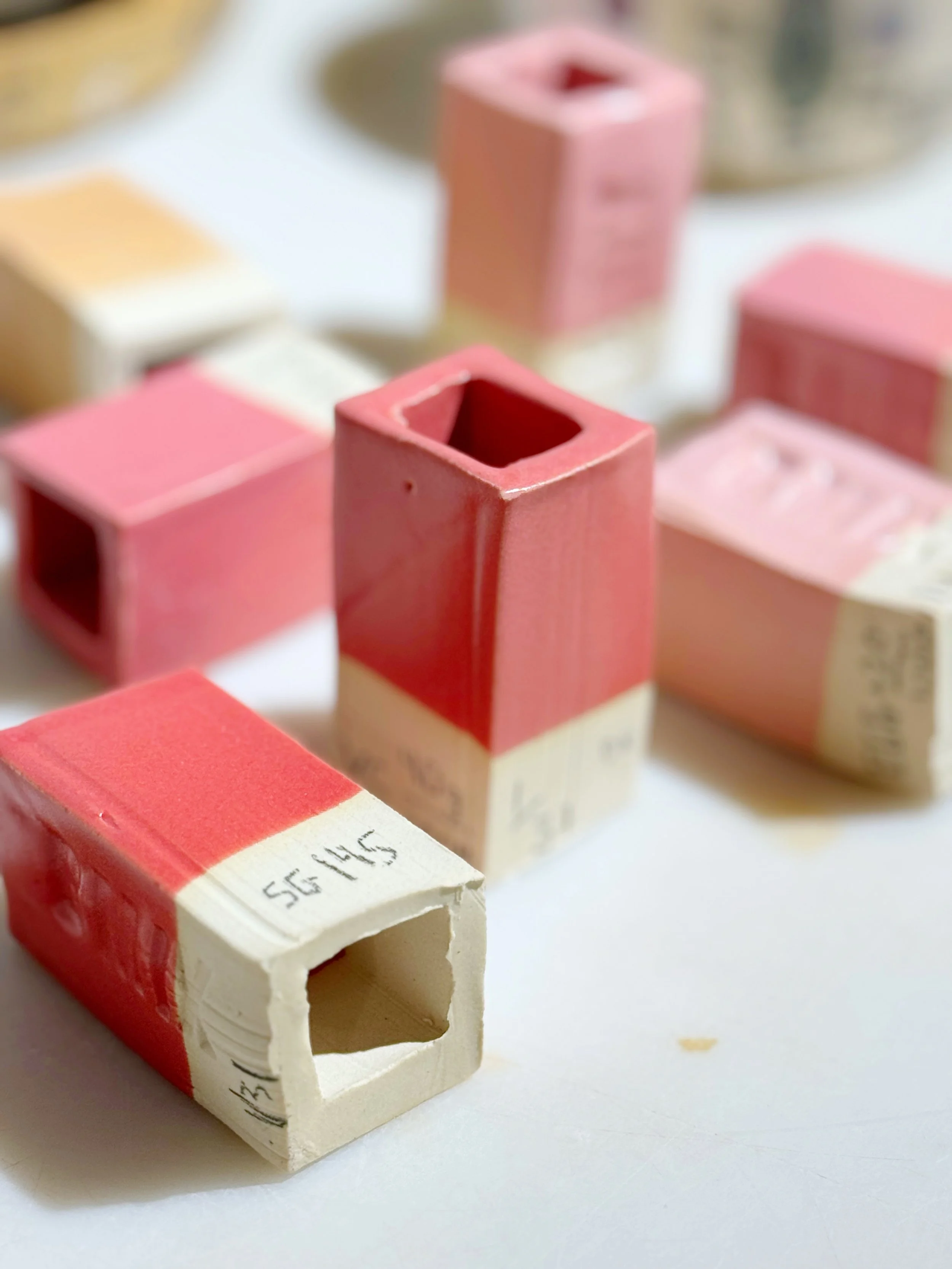
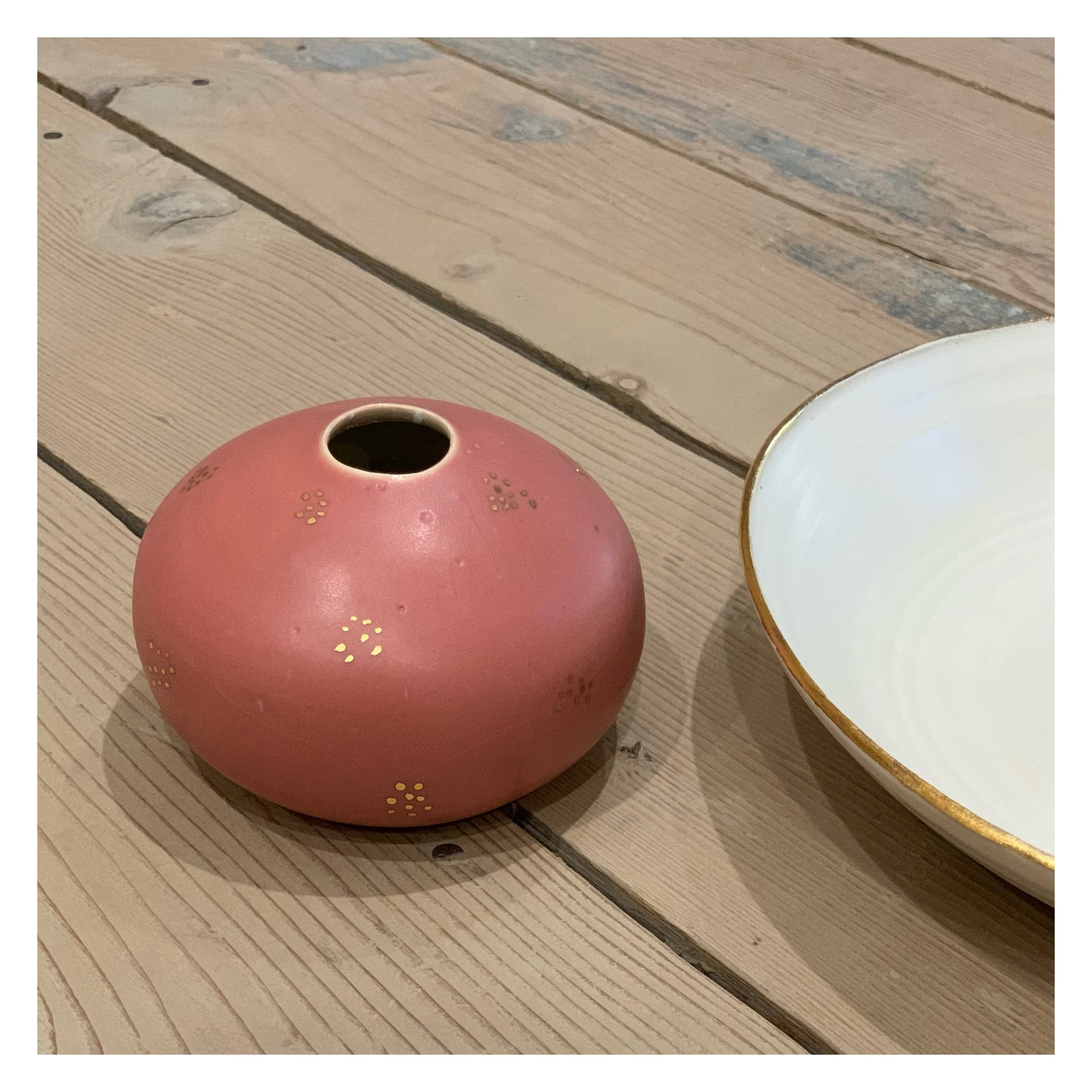
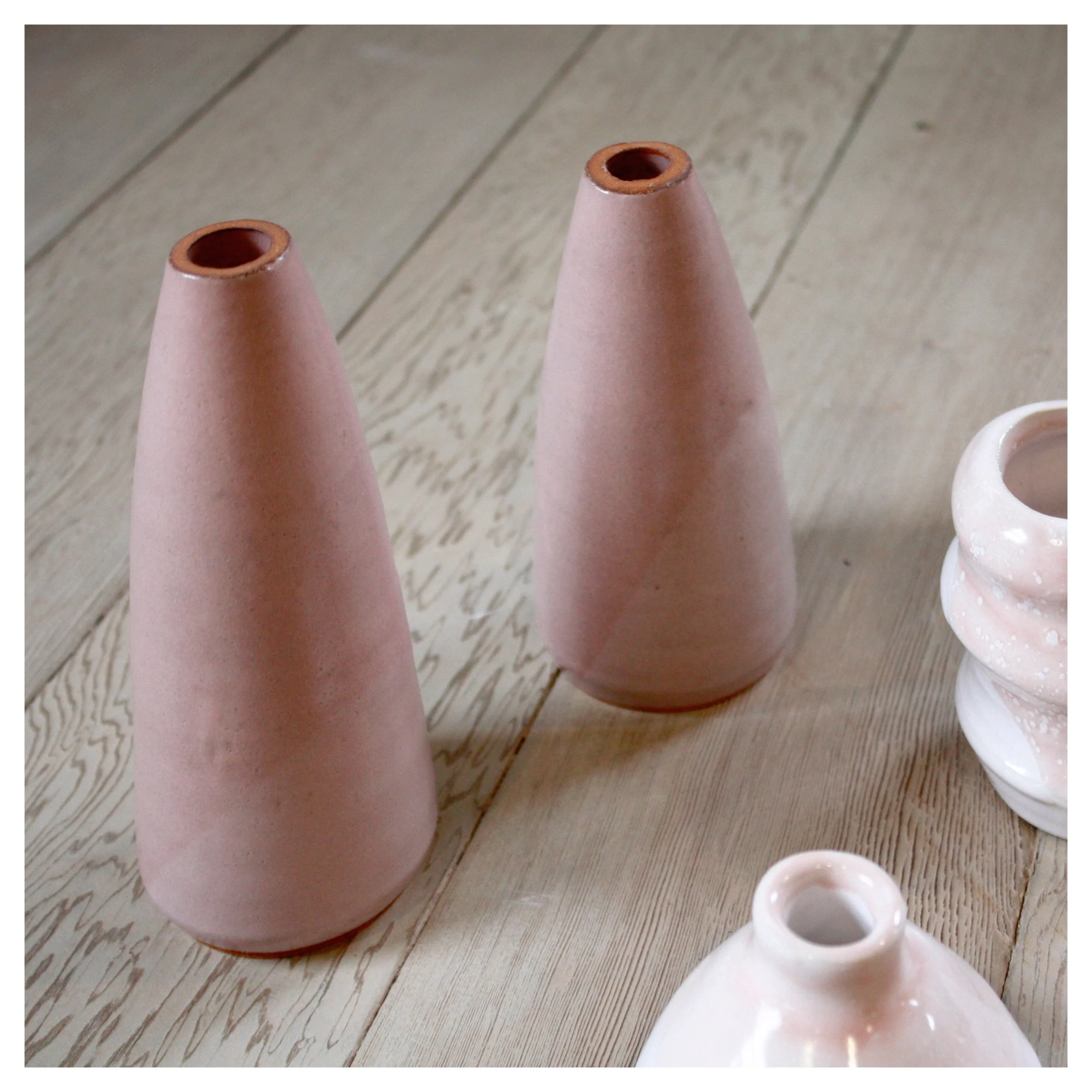
POWDER PINK
A soft, buttery pink with character — the kind of pink that doesn't read as candy or cosmetic. Powder Pink is partially transparent, which makes it interesting in ways most commercial pinks aren't.
What sets it apart:
Partial transparency — gains depth and richness on darker clays, lightens on porcelain
Mild crackle effect — a delicate surface texture that develops in firing
Layers beautifully — double dip for saturation, single dip for a wash effect
Made to evolve — looks different on every clay body and at every thickness
Powder Pink is the kind of glaze that rewards experimentation. Members who use it learn its personality.
DESIGN BENEFITS
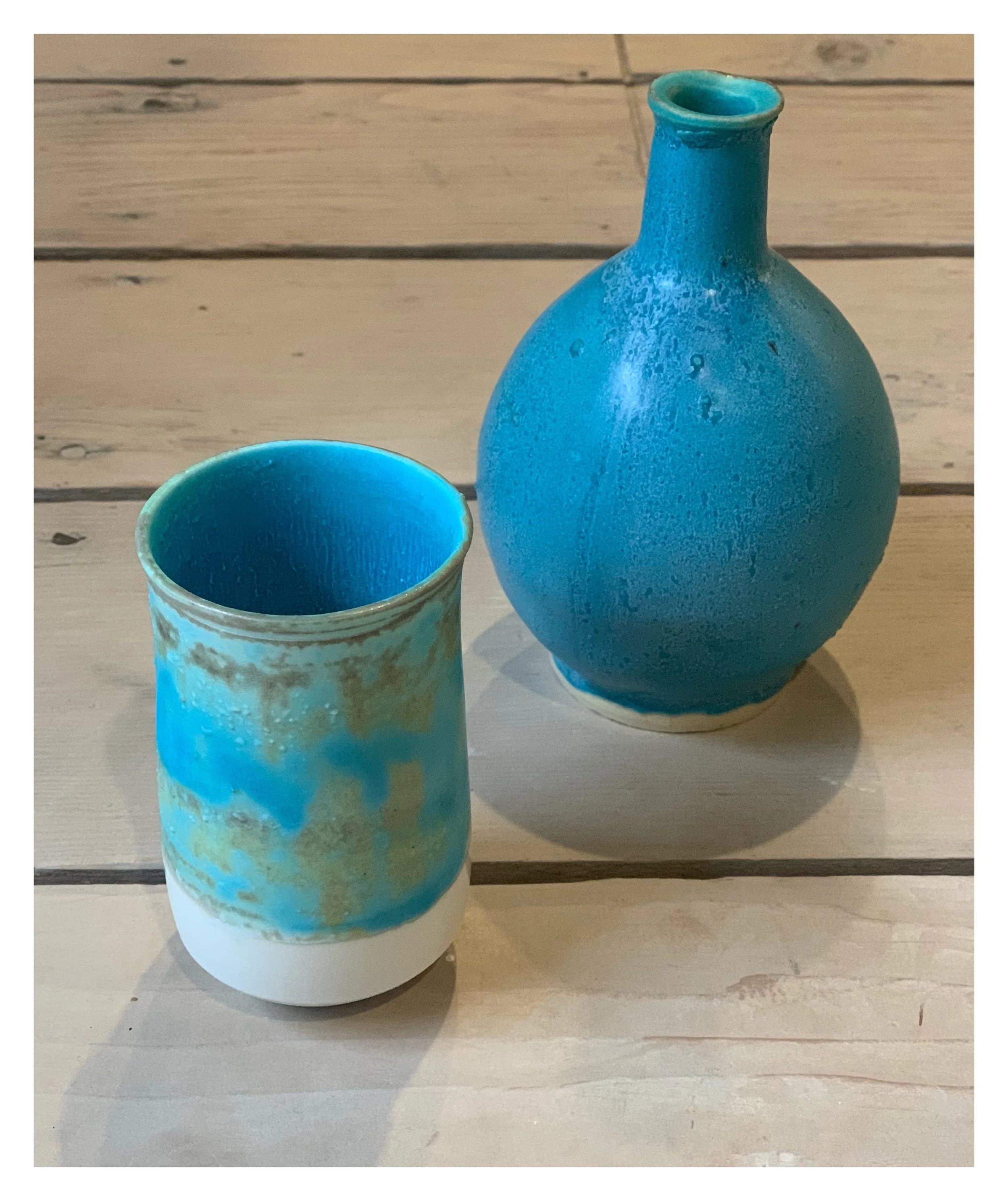
Color depth that commercial glazes can't match. When you formulate your own glazes, you can build colors layer by layer — translucent celadons over textured surfaces, satin matte finishes that catch light differently than glossy commercial glazes, depths of color that no $30 jar of premixed glaze can replicate.
Glazes designed to interact. Our glazes are formulated to work together — to layer, to break over edges, to pool in carved areas. Members can paint a base coat of one glaze, brush a secondary glaze over texture, and trust that the chemistry will cooperate. That's not always true with commercial glazes mixed across brands.
Consistency across firings. Because we mix in 10-gallon batches and test every new mix before it goes on the shelf, glazes behave the same way today as they will six months from now. Your work doesn't become unrepeatable because the studio ran out of "Glaze X" and switched to a different brand.
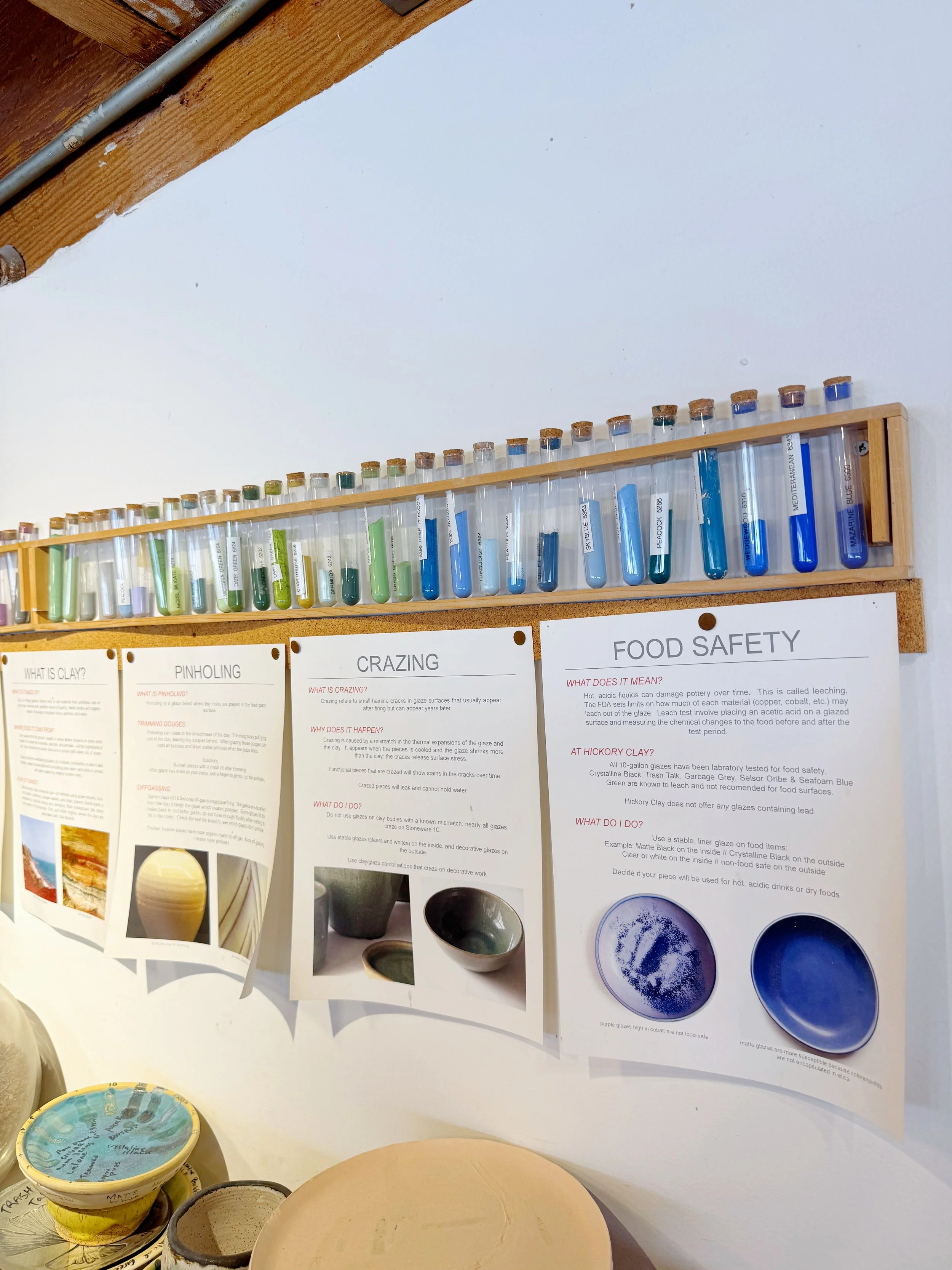
Cone 6 chemistry, formulated for our kilns. Cone 6 mid-range firing offers a sweet spot between the durability of high-fire stoneware and the color range of low-fire ceramics. Our glazes are formulated specifically for cone 6 oxidation in our two electric kilns, which means predictable results and food-safe finishes for functional ware.
HOW WE ACHIEVE IT
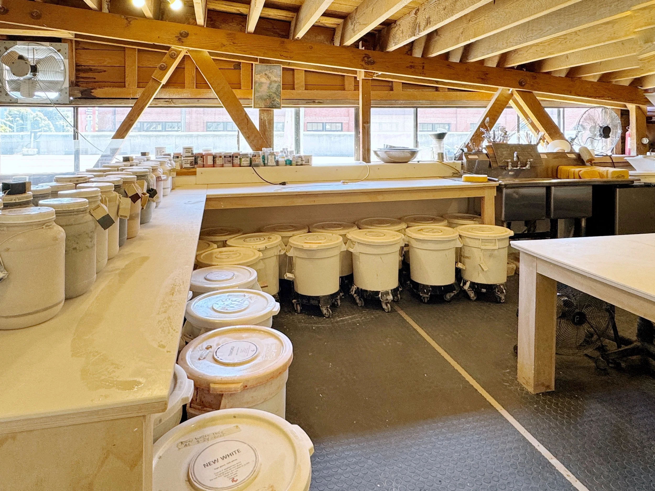
Our glazing area is a working laboratory.
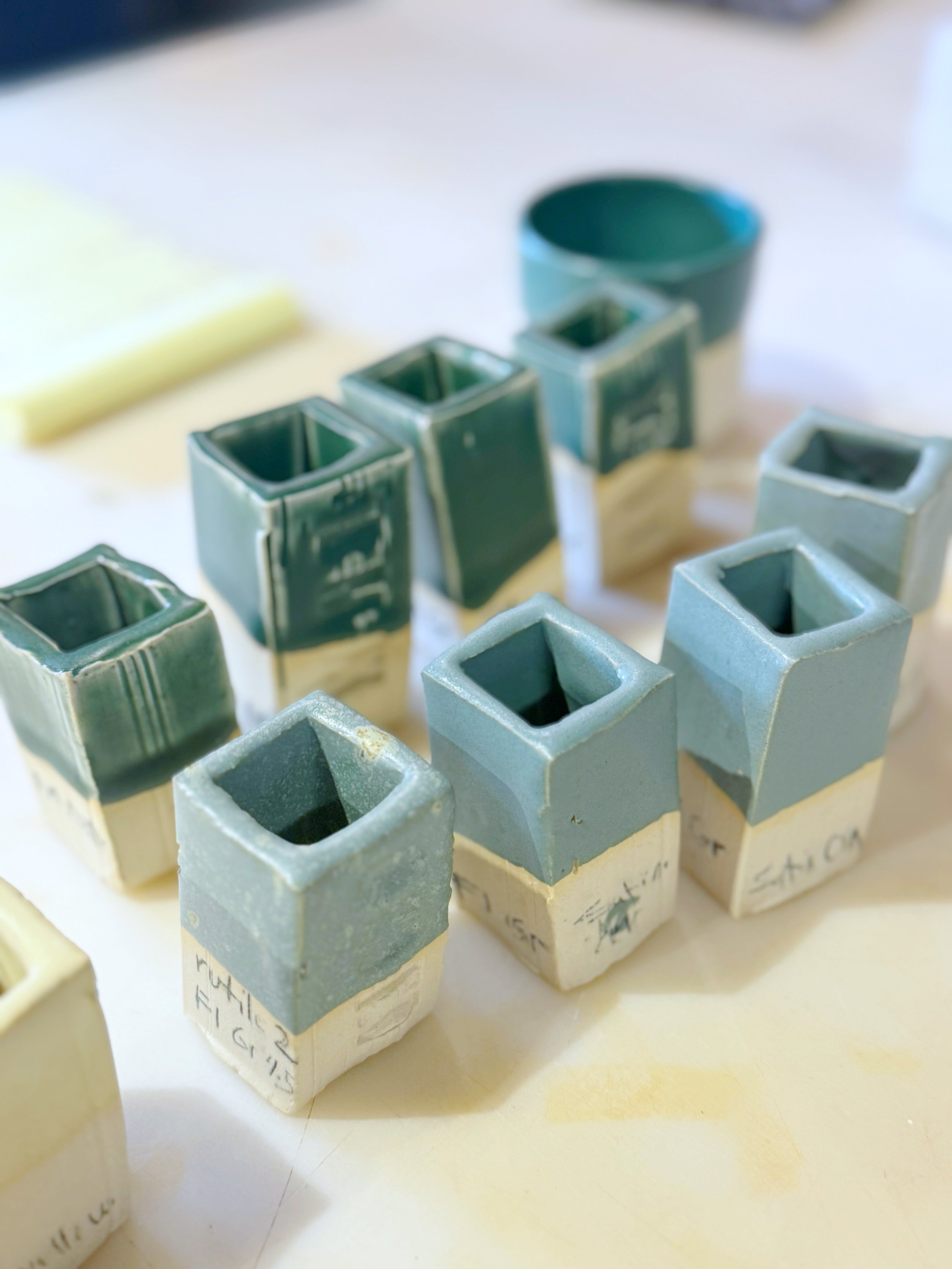
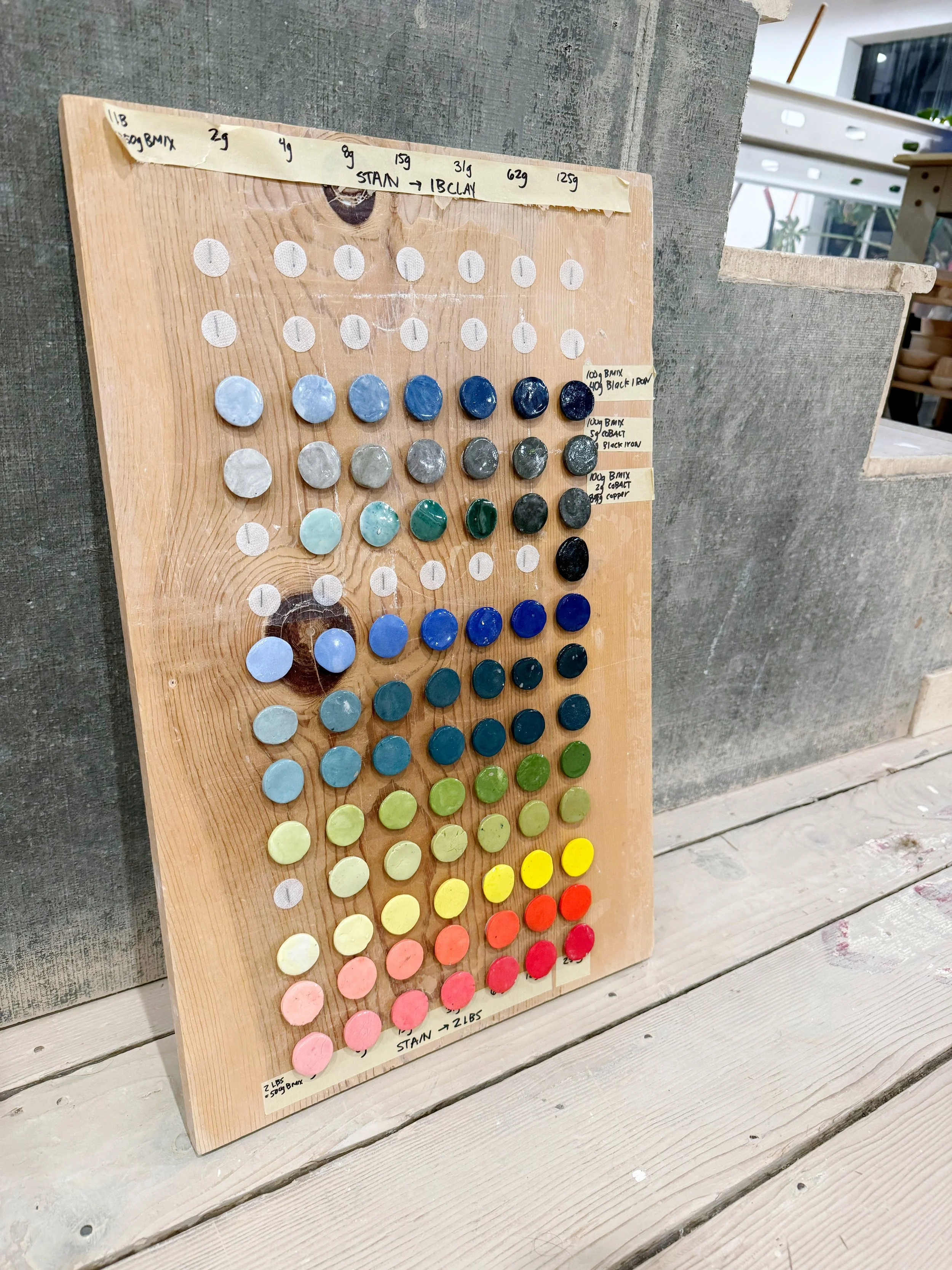
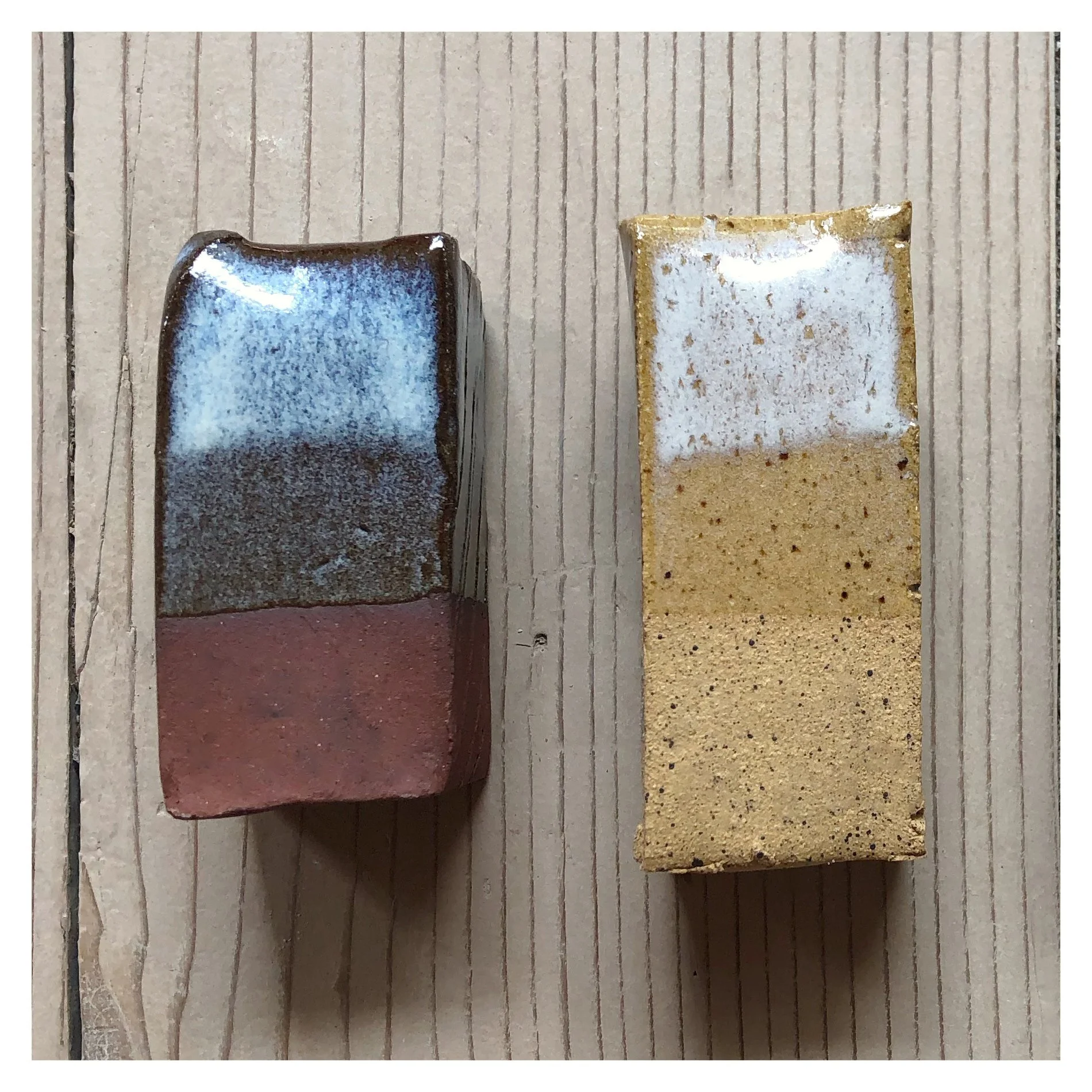
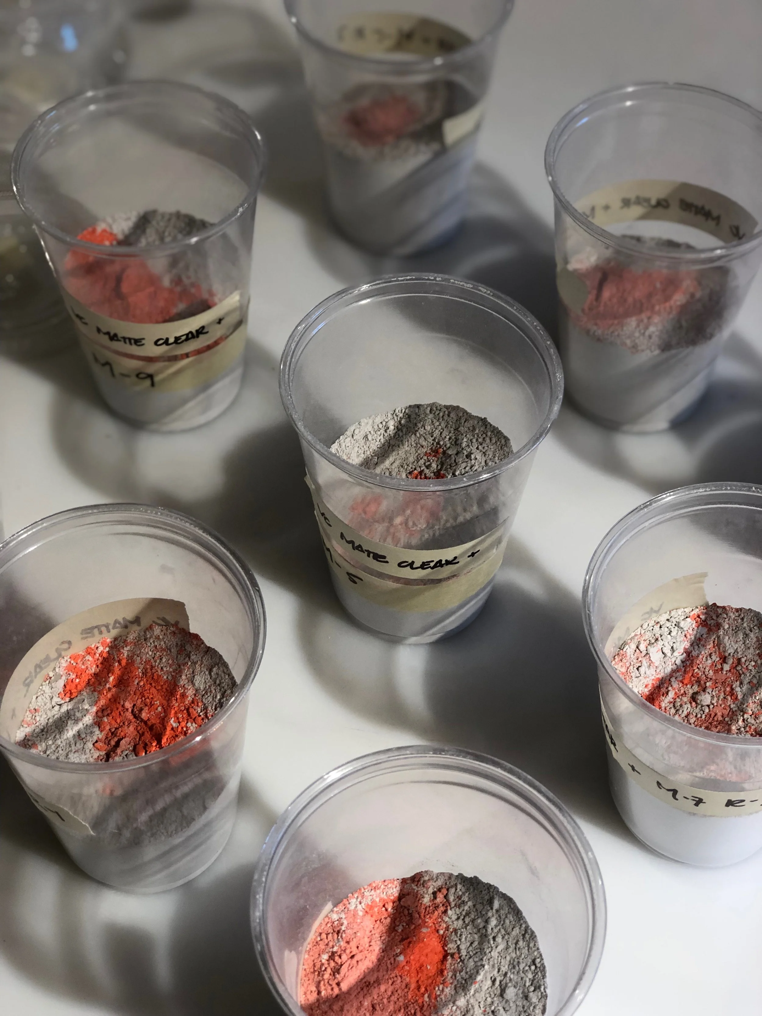
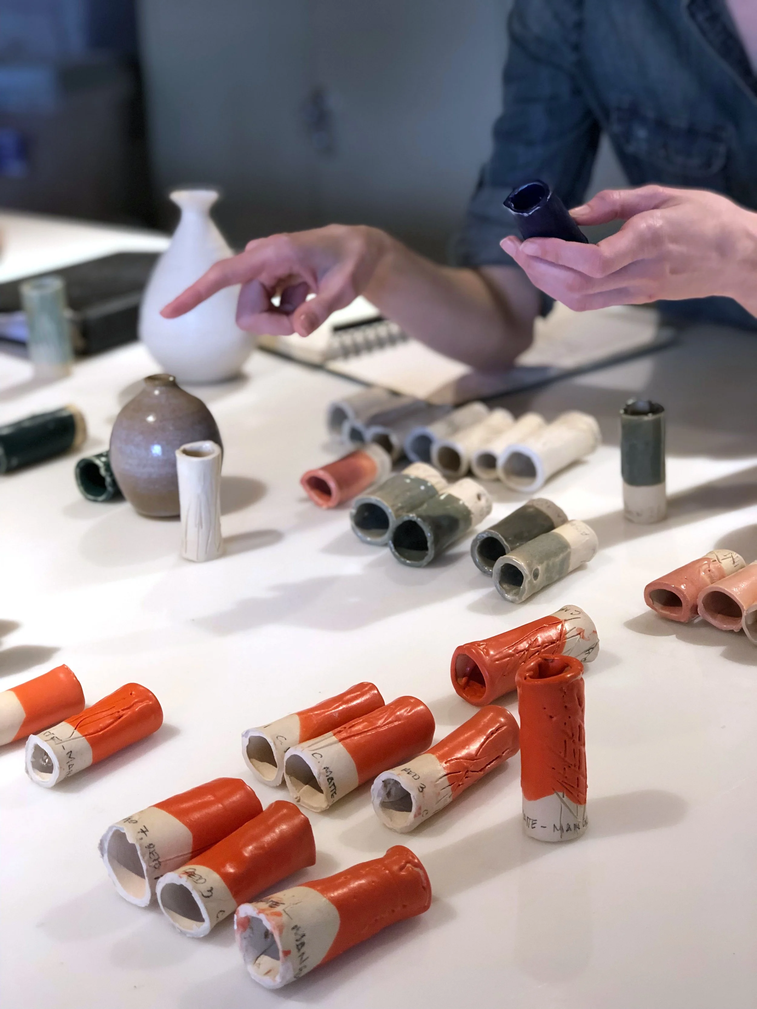
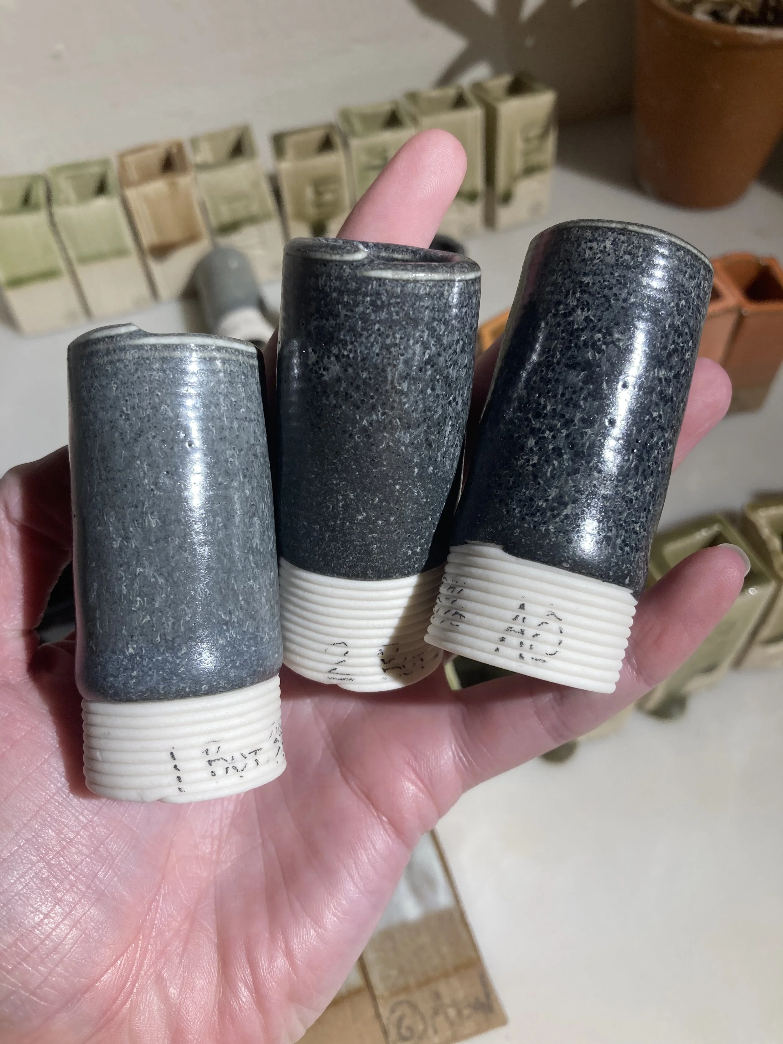
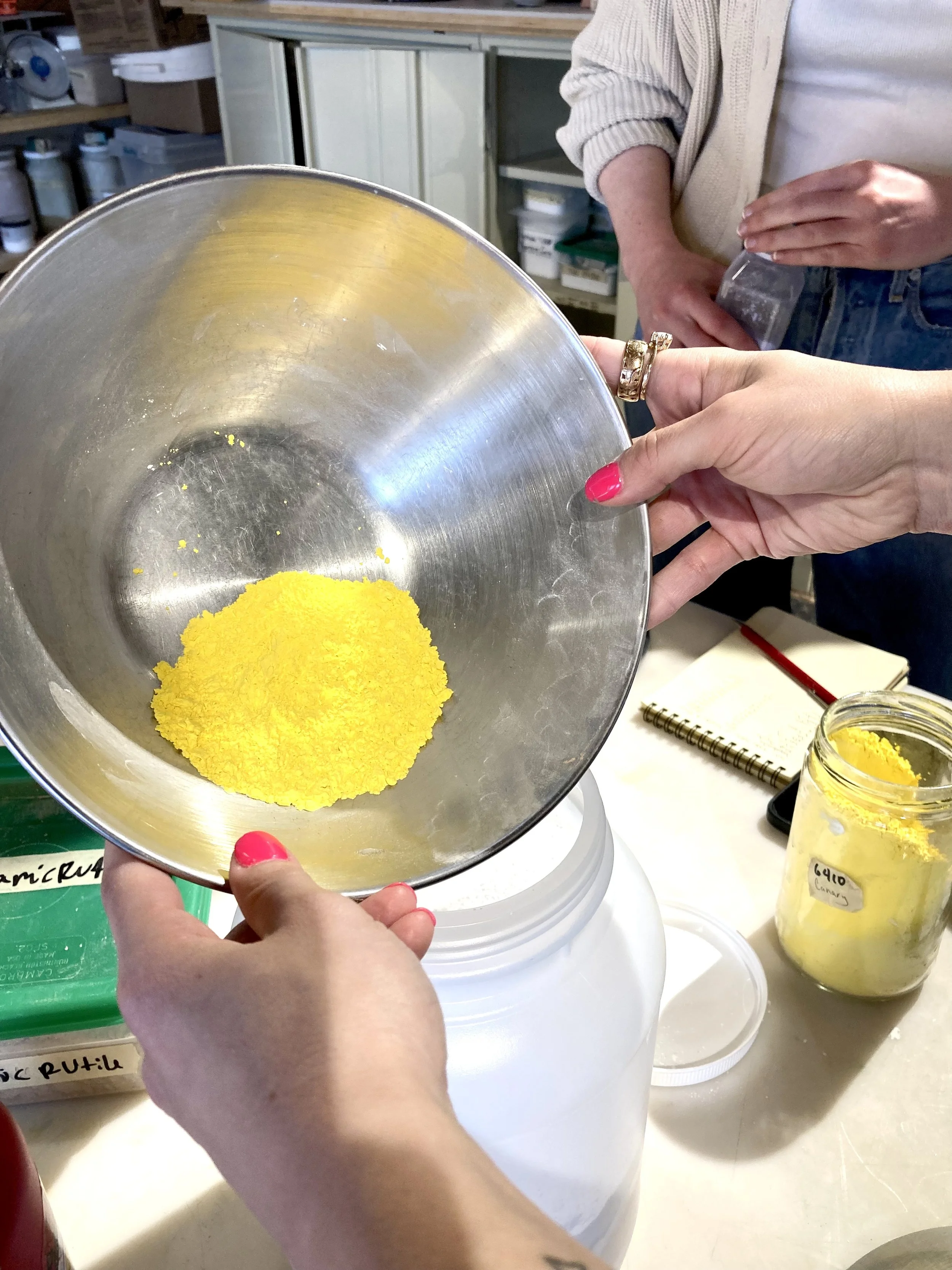
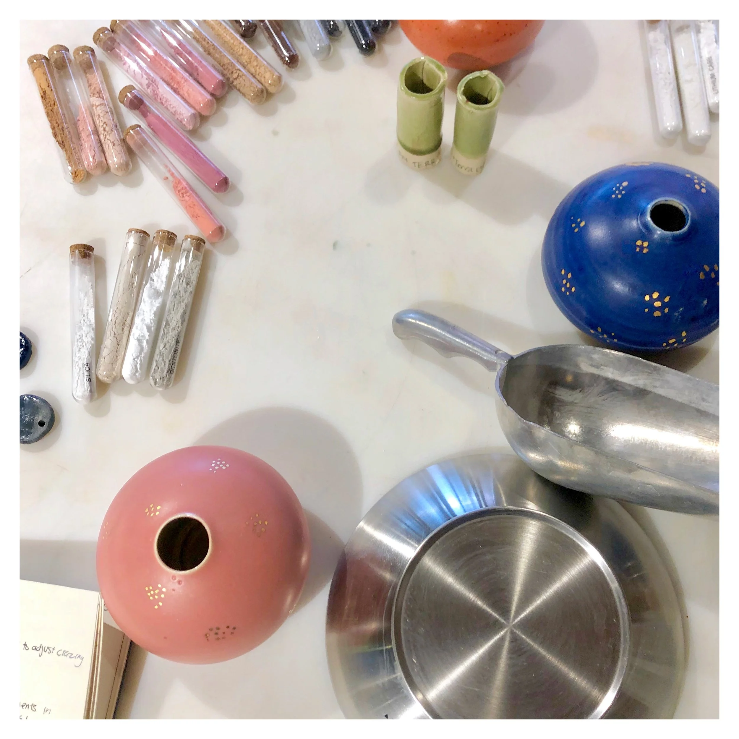
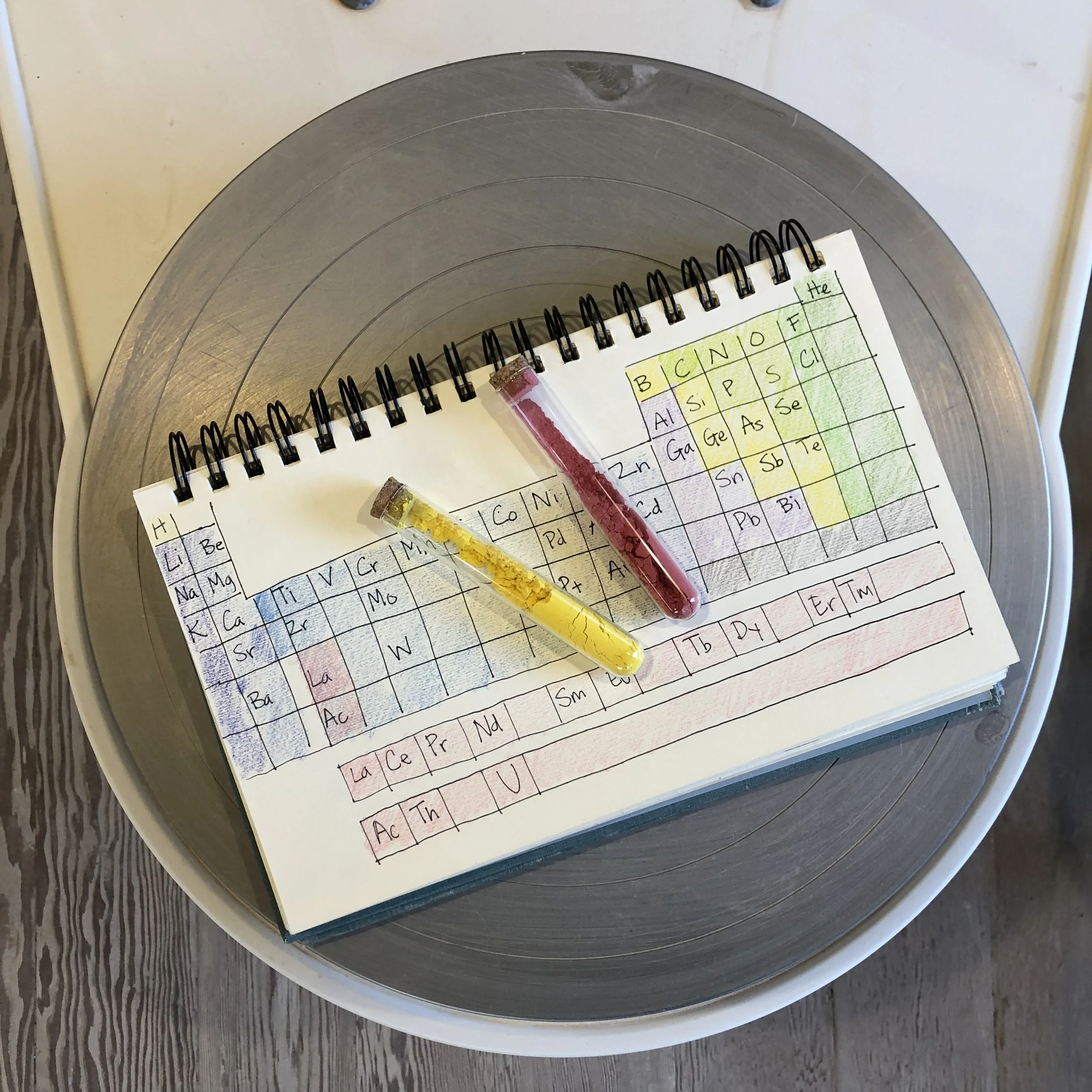
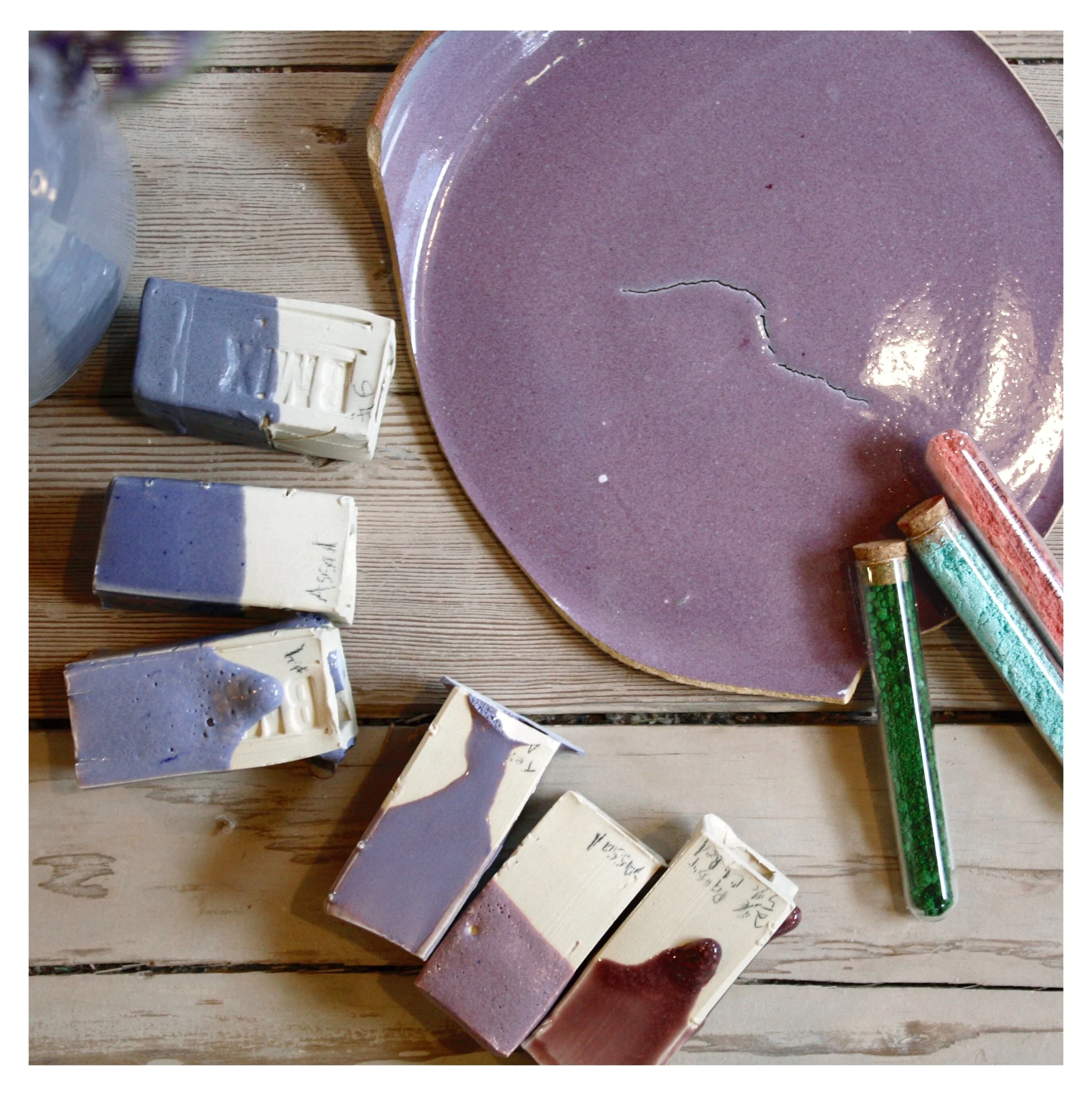
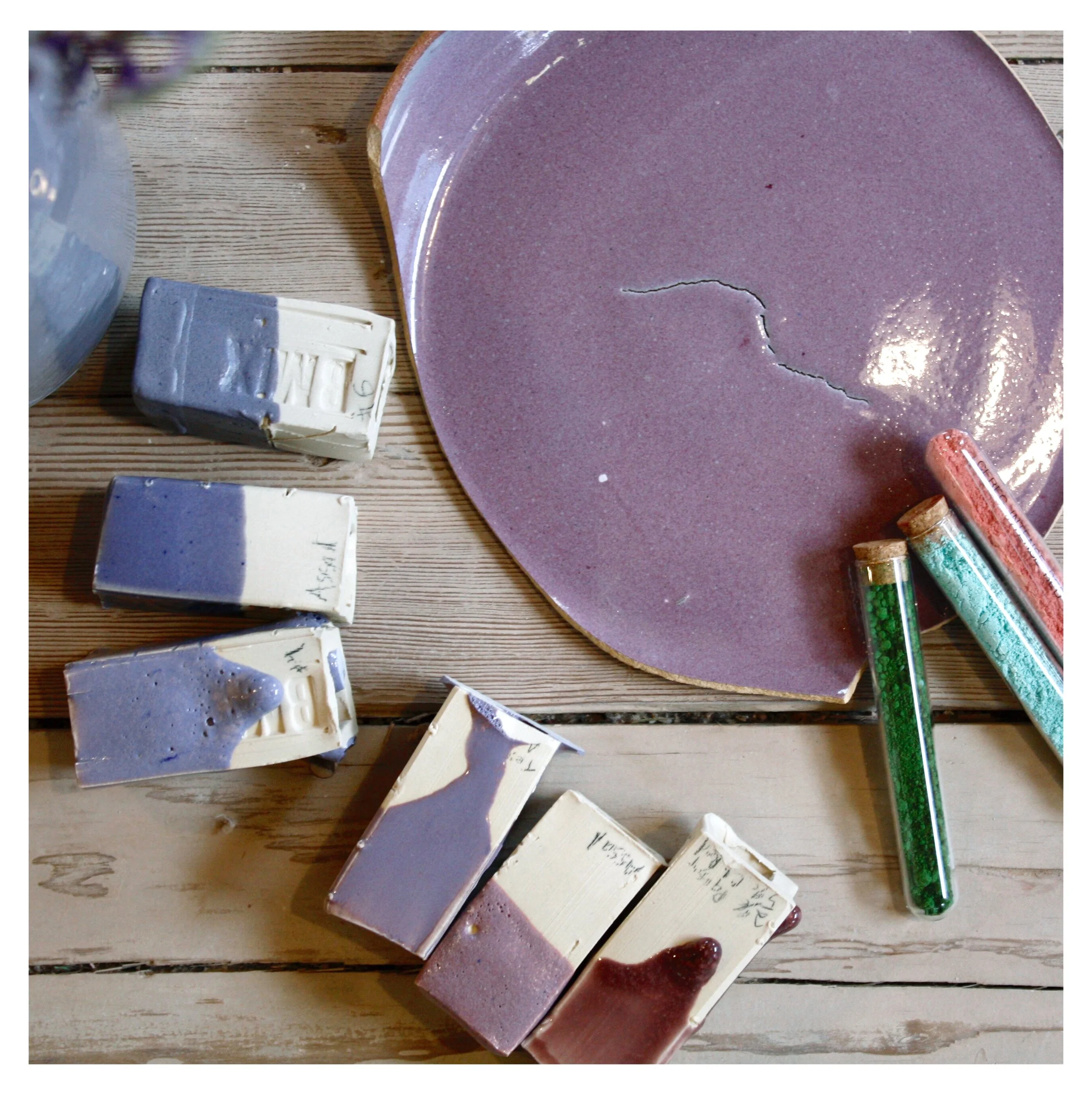
Formulation. Each glaze starts with a recipe — sometimes adapted from a published source, often developed in-house. Recipes are tested in small batches across our seven clay bodies before any glaze enters the regular library.
Testing. Every new glaze and every new batch is fired on test tiles before going onto the studio shelves. We track behavior across firings, on different clay bodies, at different application thicknesses, and over textured vs. smooth surfaces.
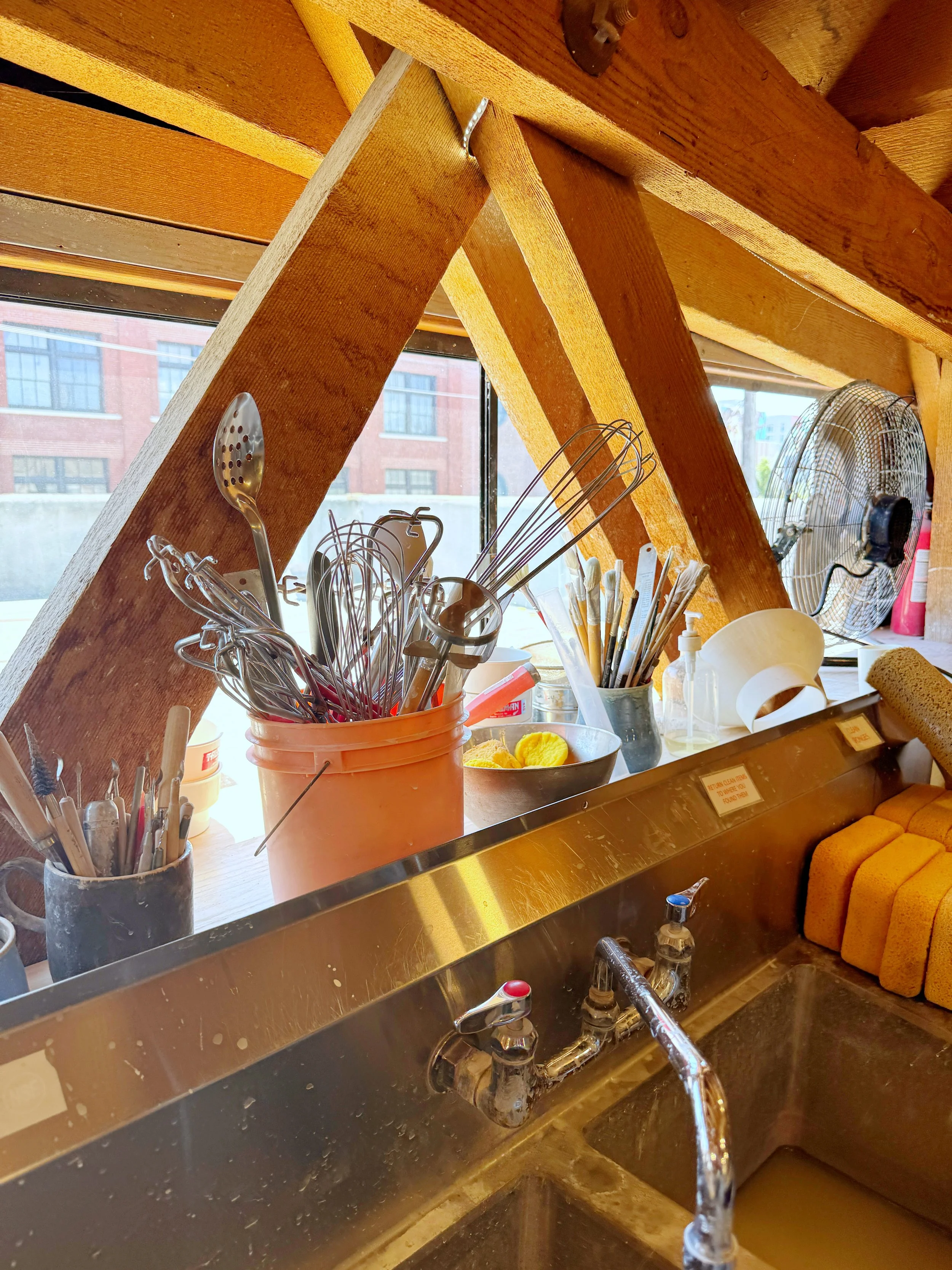
Mixing. Core glazes are mixed in 10-gallon batches; seasonal glazes in one-gallon batches. Mixing happens in our dedicated glaze area, with a large two-compartment sink, sieves, scales, and storage for raw materials.
Quality control. Glazes are sieved before going onto the shelf and rotated as they're used. The studio also stocks slips, mason stains, and underglazes for additional surface decoration, and we maintain a separate Gold Luster firing for members and students who've completed our Gold Luster workshop.
Documentation. Glaze recipes, behavior notes, and firing results are kept on file at the studio. Members curious about how a glaze was developed are welcome to ask.
GLAZES ARE INCLUDED IN YOUR MEMBERSHIP
There are no separate glaze fees at Hickory Clay. Every member and every student has full access to our entire glaze library as part of their membership or class — whether you use one glaze or all 65 over the course of a year.